Making Financial Literacy Enjoyable
Type: Student Project (Flatiron School)
Role: Product Designer, Art Director, Illustrator
Timeframe: 11 Days
Children ages 10–12 need an appealing and dependable digital product that makes learning about money fun in order to develop early money habits that can benefit them in early adulthood and beyond.
Lemon Academy aims to solve this issue by offering a 5–week interactive live course taught by professionals. By incorporating the concept of running a lemonade stand into lesson plans, kids can grasp more complex topics like the economy, the stock market, and compound interest more easily.
Responsibilities
Provided with a brief outlining of Lemon Academy's needs and goals, I aimed to create a youthful and engaging brand approach to bolster its mission while appealing to children and parents alike.
By the end of 11 days, I planned to deliver a set of brand guidelines along with designs for the landing page and student dashboard that would effectively display how the brand could be applied throughout multiple touchpoints.
Sizing Up the Competition
Before beginning any designs, it was essential to scout out a few competitors to understand and compare their approaches to colors, typography, tone of voice, etc. In addition to what was shown in the competitive analysis chart, I also looked to understand how each of these competitors set up the page structure of their landing pages.
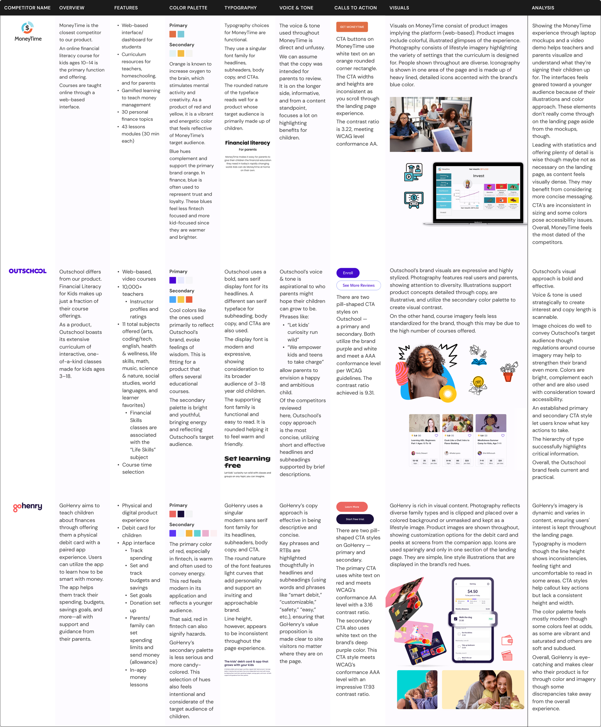
Identifying Trends
Overall, bold, complementary color palettes and rounded features in brand artifacts, such as CTA buttons and iconography/illustrations, seemed to bode well for this target audience. Typography across the board leaned more modern, with sans serif fonts used for headlines/subheads and body copy. Finally, from an imagery standpoint, finding ways to reflect who the target audience is and visually convey what the product is can support messaging.
Understanding What to Avoid
As important as it was to compare the good of each competitor, there was also plenty to learn from the not-so-good. Competitors with short and scannable copy felt easy to engage with, while the products that used walls of text and long paragraphs were difficult to get through and visually heavy. Additionally, some sites had discrepancies in button sizes and text spacing, which read as an oversight rather than intentional design decisions. Establishing parameters around brand artifacts such as these could help us avoid any negative impact on our users’ trust.
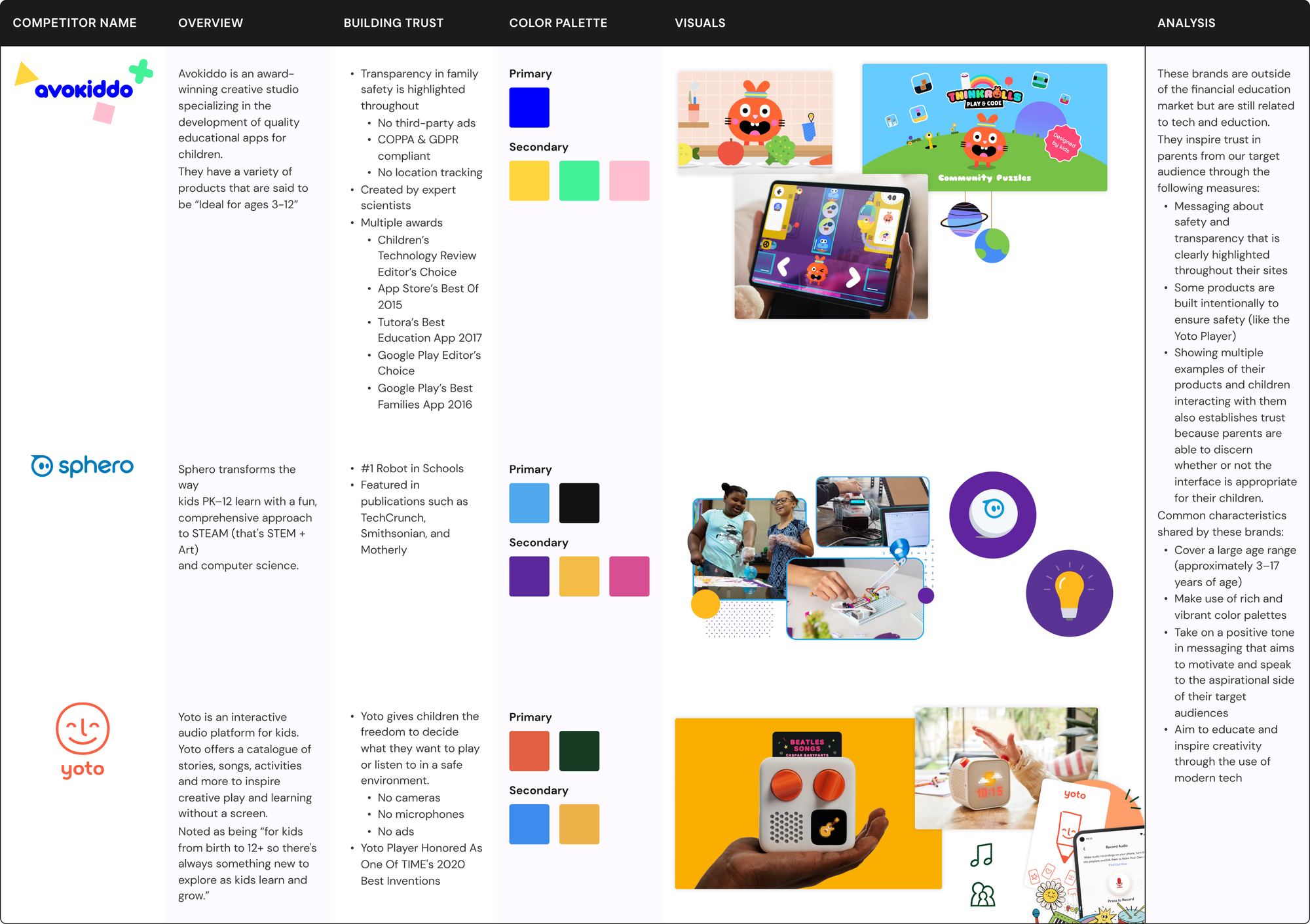
Looking at Other Trusted Children's Brands
Beyond any direct competitors, I also wanted to consider brands outside the financial education market to pick up on more trends and understand how they inspire trust in parents from a shared target audience. During this phase, I looked at brands that were still related to tech and education.
While this round of competitive analyses was slightly less in-depth than the first round, I saw similar color trends and visual approaches. I also found inspiration in how Lemon Academy could plan to implement messaging about safety and privacy on their page realistically, considering the early state of the company and lack of outside credentials (i.e., awards, press, and testimonials).
Developing the Look and Feel
With all the insights gathered, I was ready to move on to consider the Lemon Academy brand, developing guidelines around color, typography, imagery, iconography, tone of voice, and motion.
Color Palette
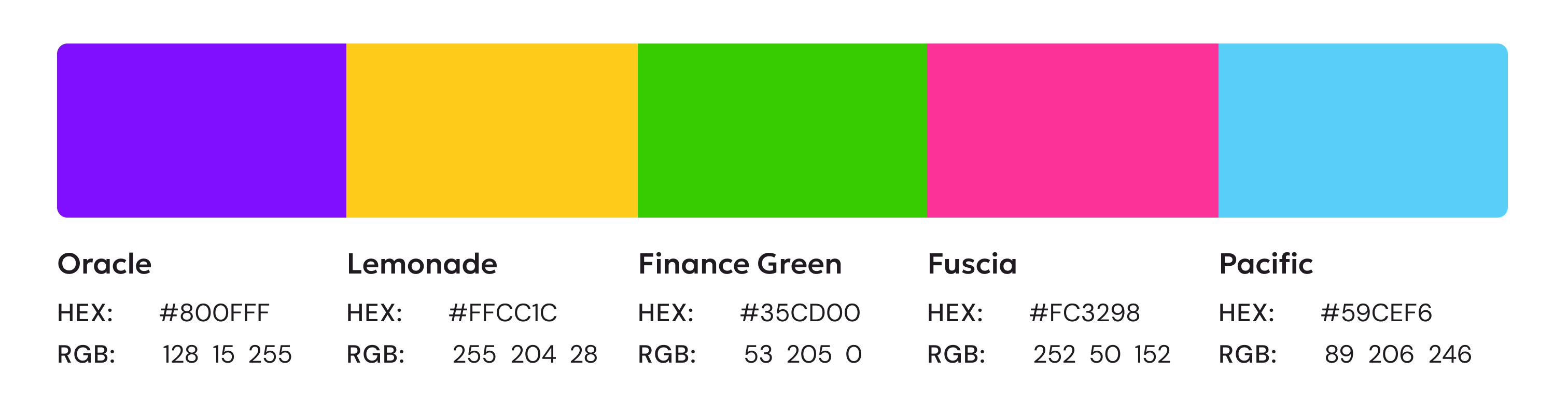
Starting with colors, inspiration was pulled from our competitors and Fintech companies, adjusting each hue to feel punchier and saturated for a modern and youthful twist. Purple would be used as the main brand color — a perfect choice given that studies have shown that nearly 75% of pre-adolescent children prefer purple over any other color. It is also known to inspire creativity.
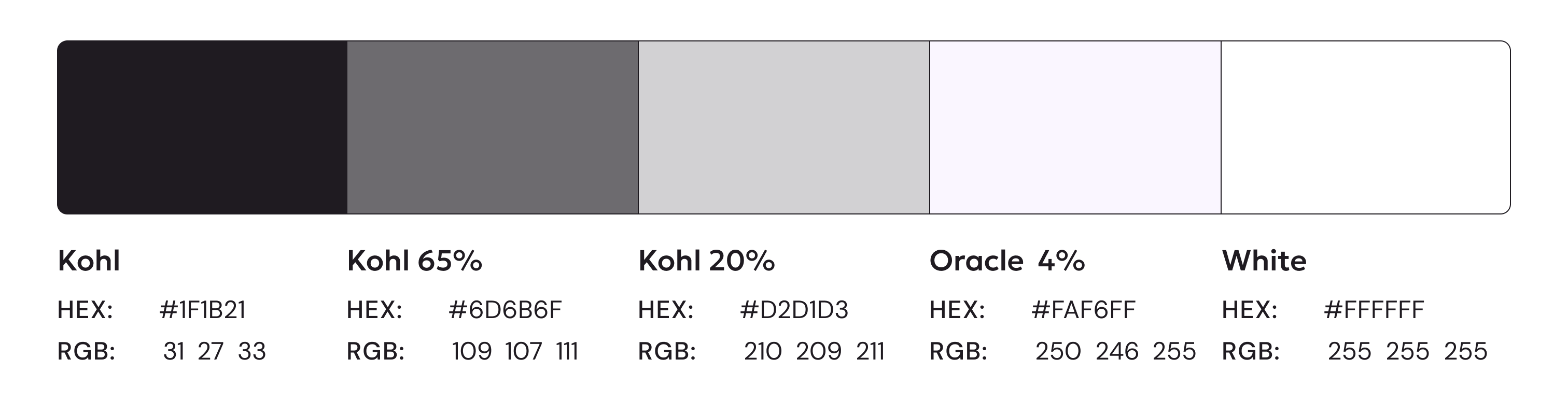
Supporting colors were a bit more subdued, defining any colors intended for body copy and tertiary UI elements. These colors would aid in allowing critical features to really pop.
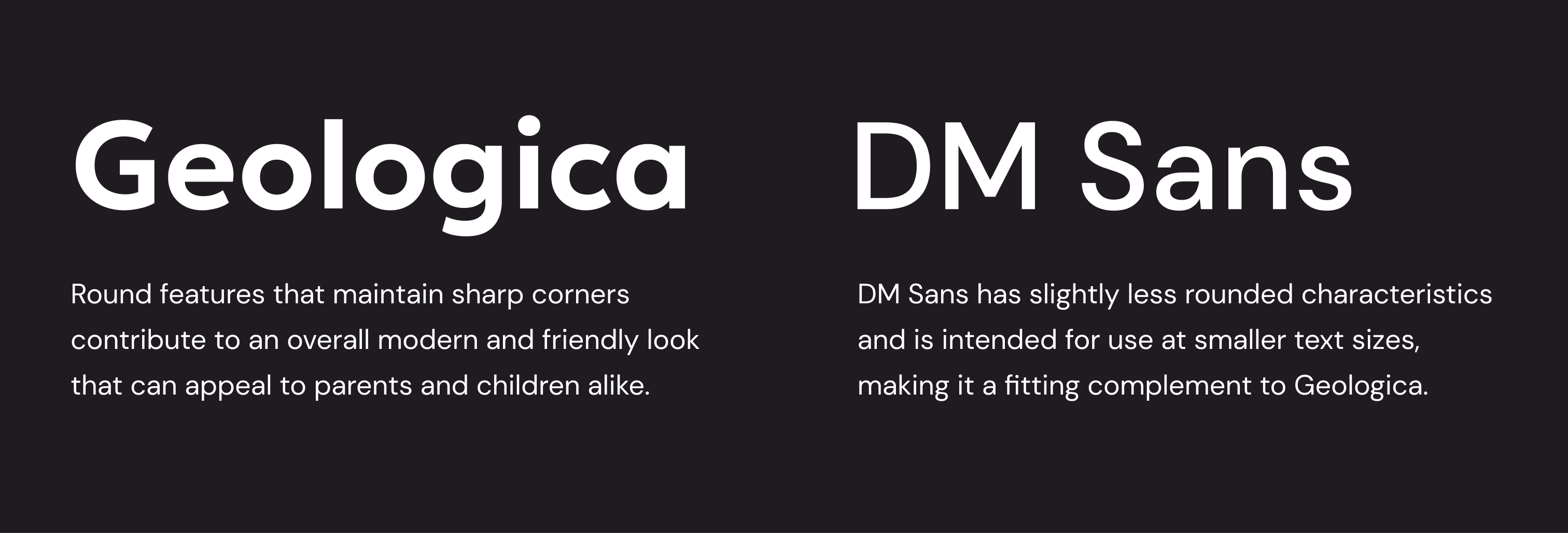
Typography
For typography, complementary sans-serif fonts were selected to support a modern and inviting look and feel.
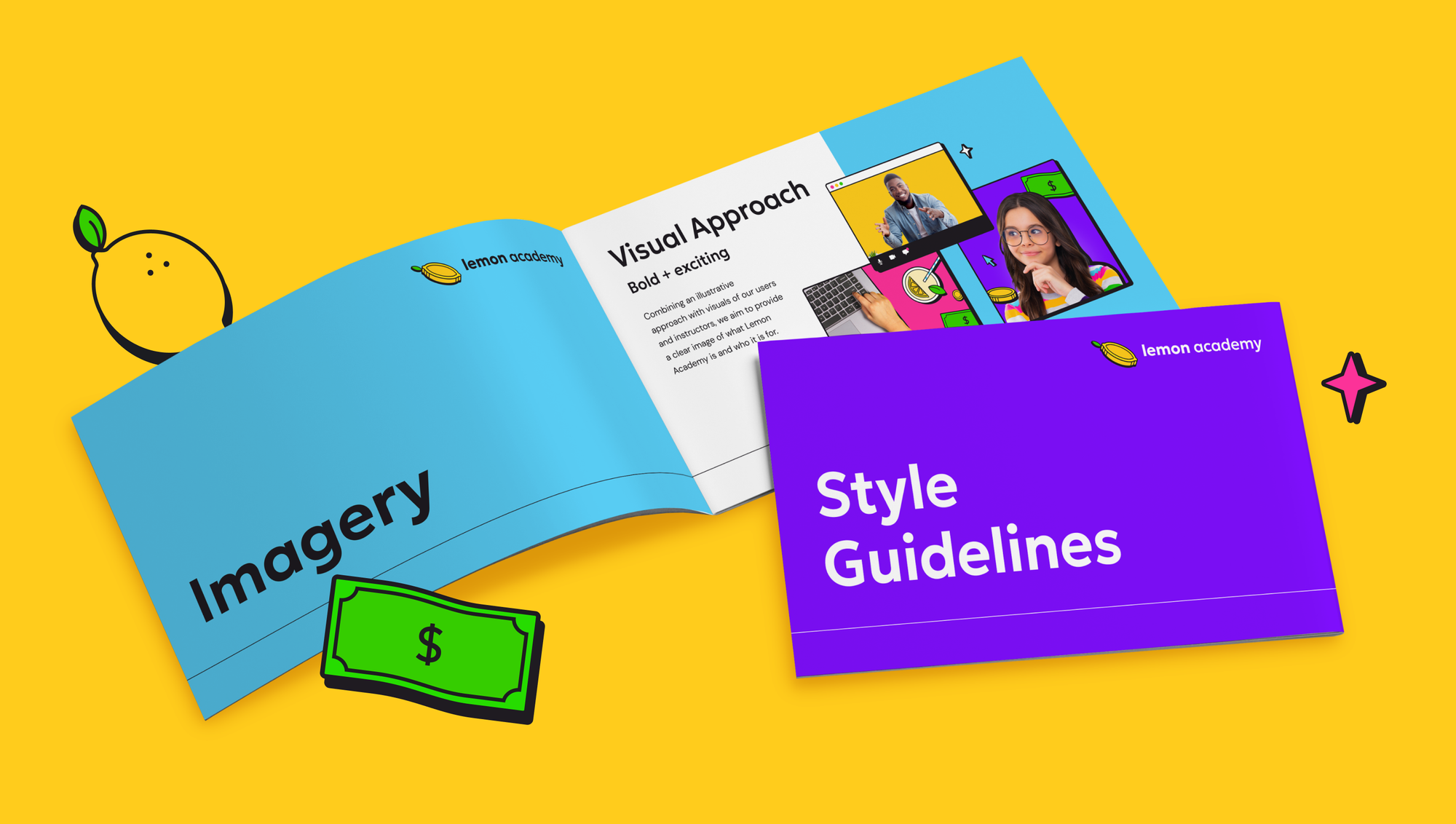
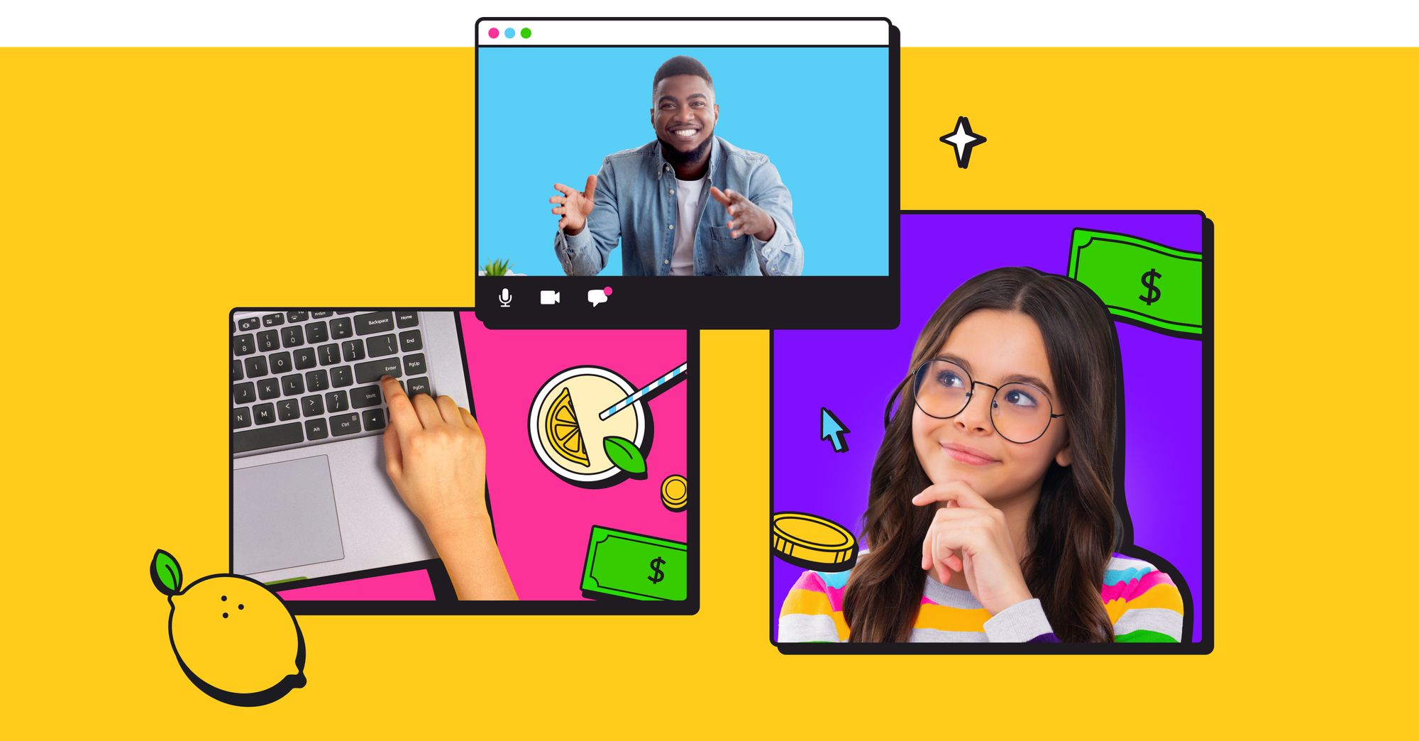
Visual Approach
Lemon Academy offers classes taught over Zoom and is adamant about making it clear that no real investing will take place during the course span. This was heavily considered when developing the visual style. Images thoughtfully combine photography and illustrations to tell the story of what Lemon Academy is and who it is intended for.
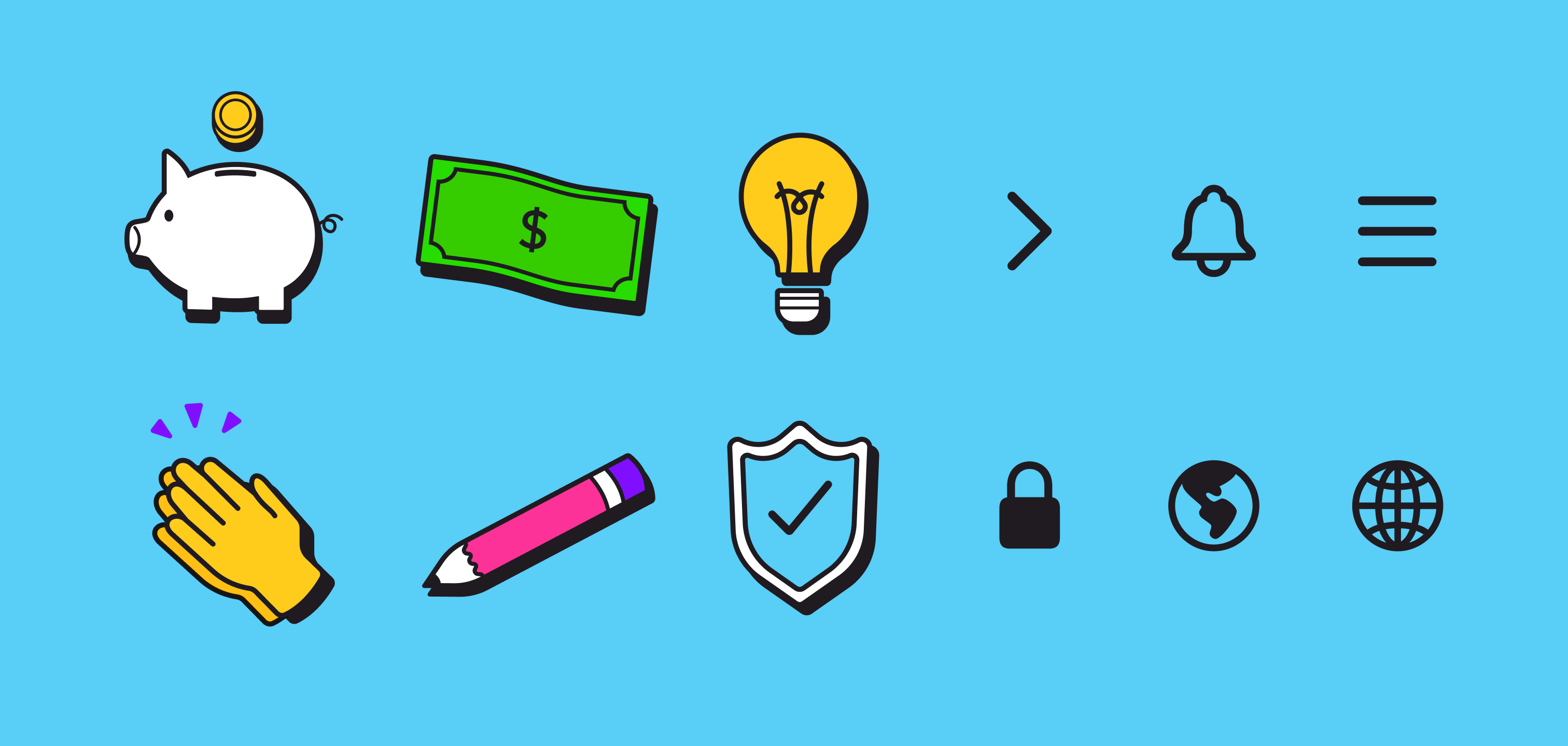
Illustrations and Iconography
Illustrations and icons are intended for use throughout Lemon Academy's varying media. Both have similar characteristics, such as mid-weight, rounded strokes, and rounded corners. These features support an overall friendly and youthful brand approach.
Tone of Voice
Defining three of Lemon Academy's messaging pillars ensures a consistent approach in tone across all touchpoints.
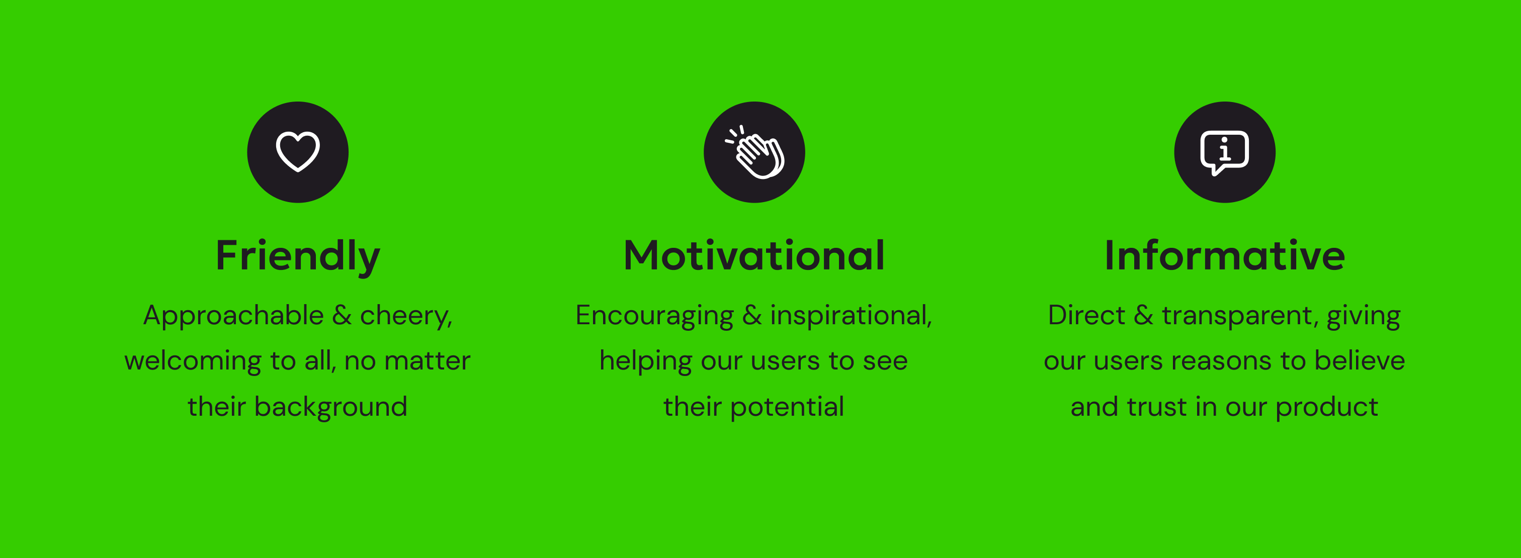
Including examples provides copywriters and designers a base understanding of what the brand aims to achieve through writing.
Motion
When considering animation for the Lemon Academy brand, we really only want to think about it in terms of microinteractions. All motion is triggered by user actions, providing them with real-time feedback, and there is never any looping animation, ensuring that this product is accessible to a wider range of potential users.
You can check out the Style Guidelines presentation below:
Mapping Out the Content
Per the brief, Lemon Academy needed a digital experience for parents to learn about the program, sign up their children for a course, and access relevant resources. Additionally, the children needed a digital experience to onboard for the program and get their first lesson on Money 101.
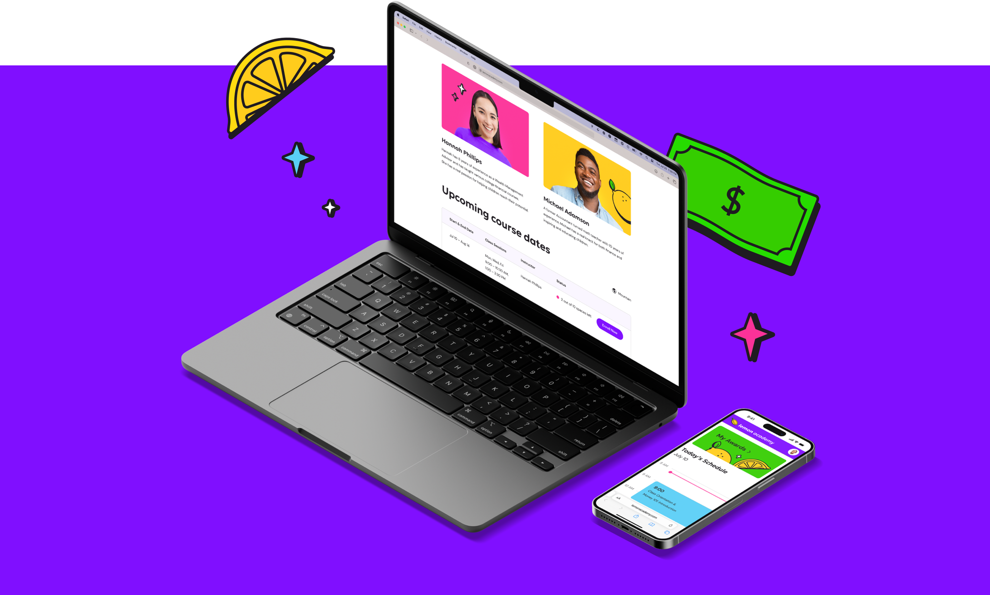
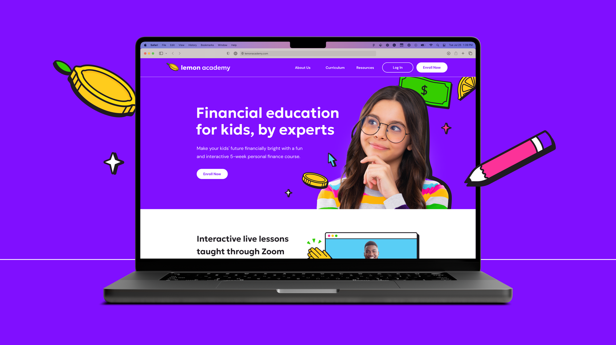
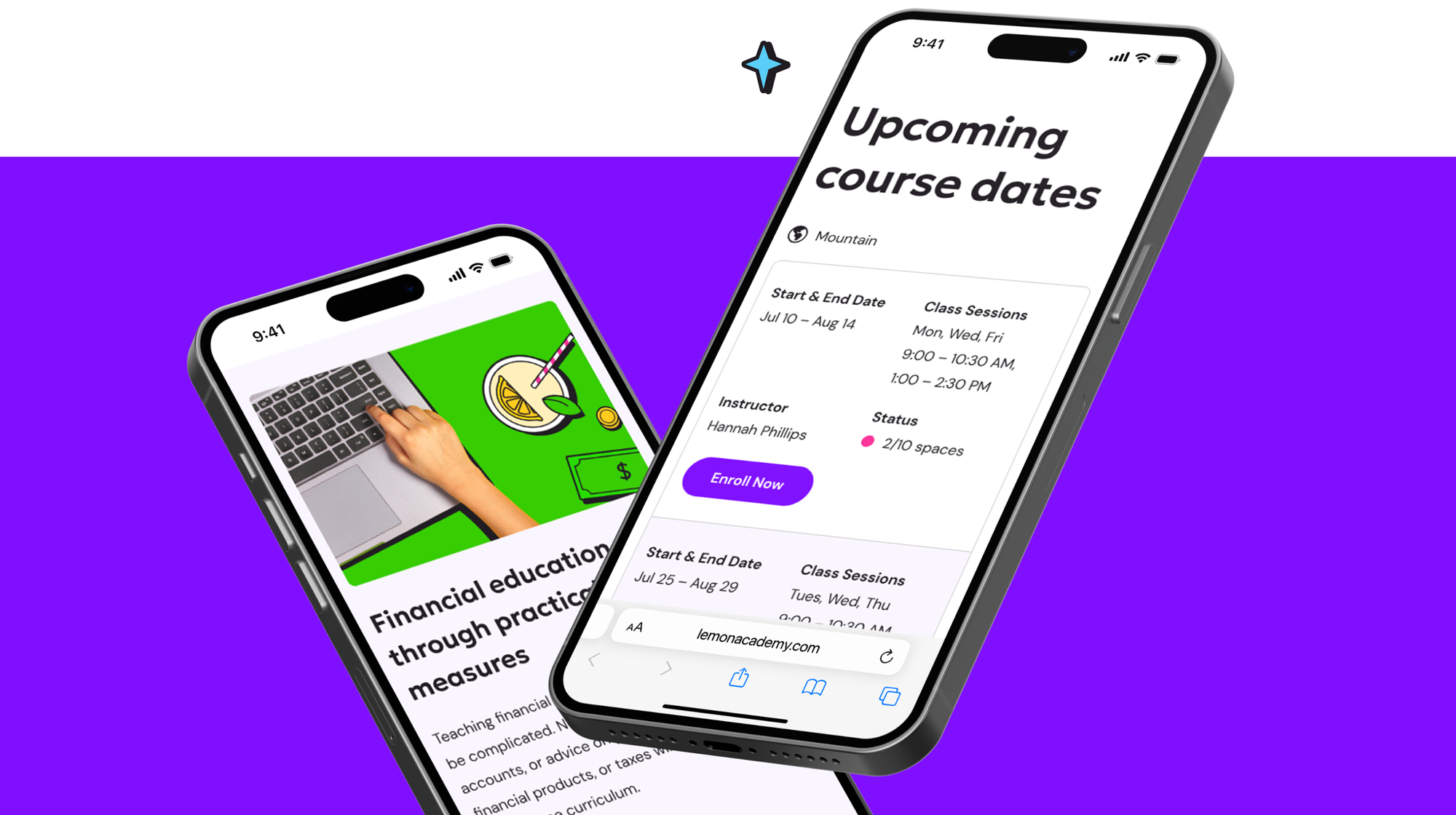
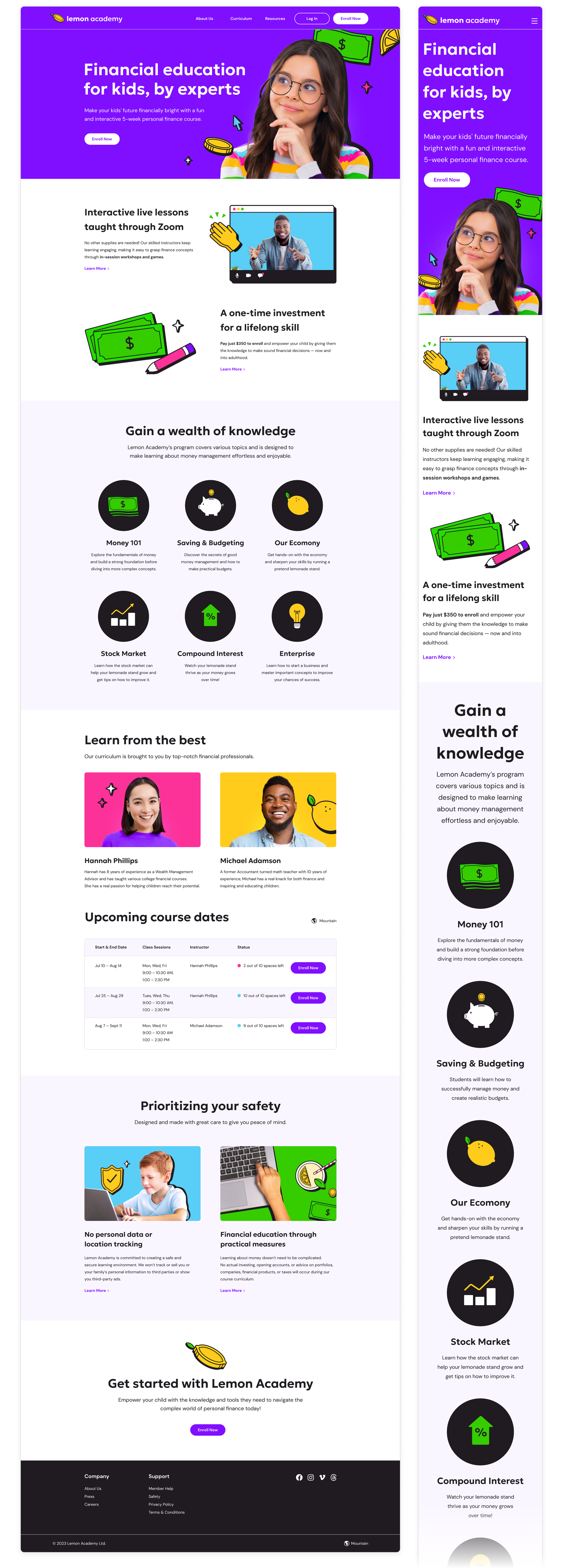
Landing Page
In the mid-fidelity design for the landing page experience, I wanted to provide parents with a place to learn about Lemon Academy and its instructors and a way to enroll their children and view upcoming course dates. Additionally, I considered ways to include messaging around safety and privacy.
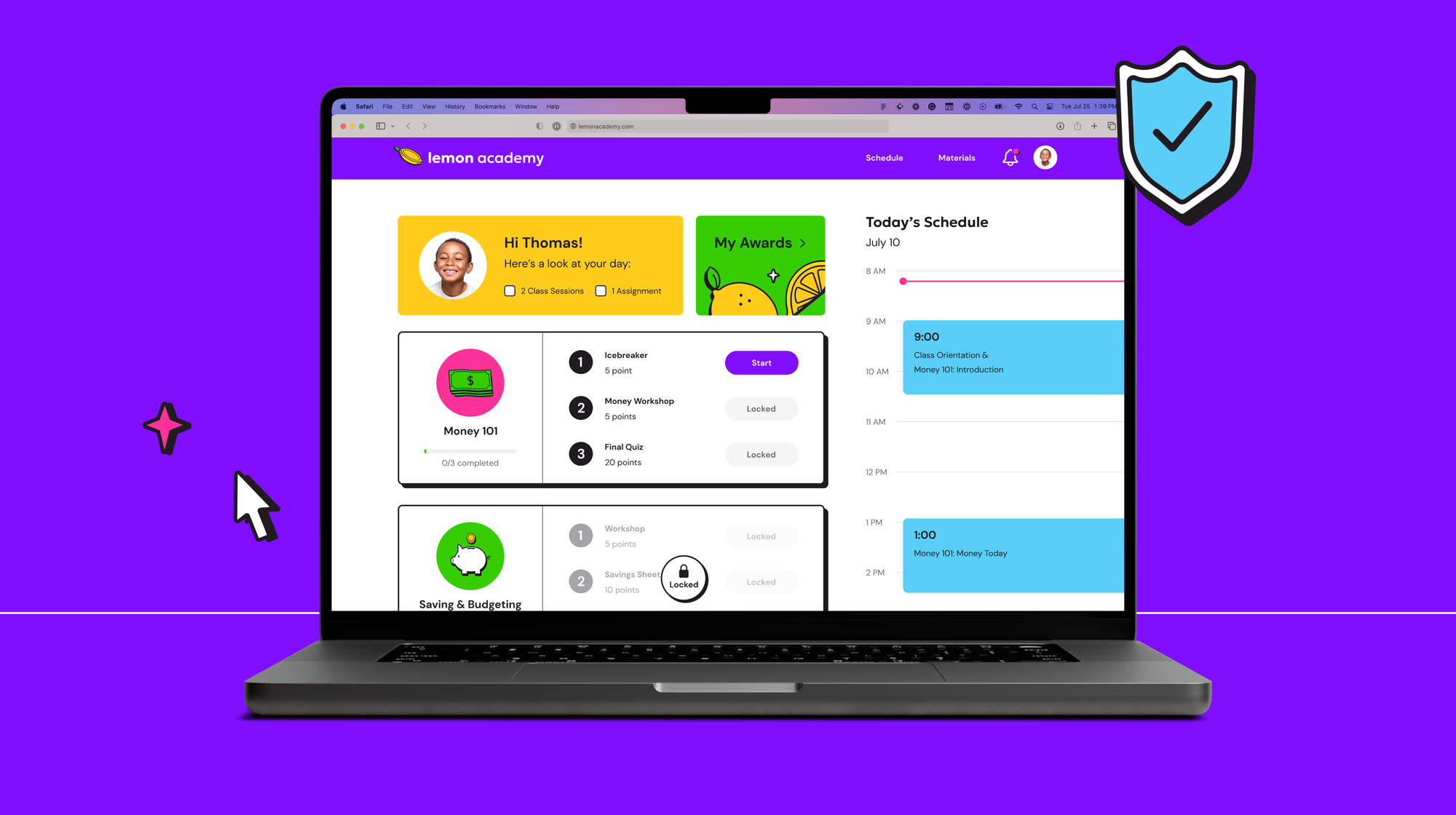
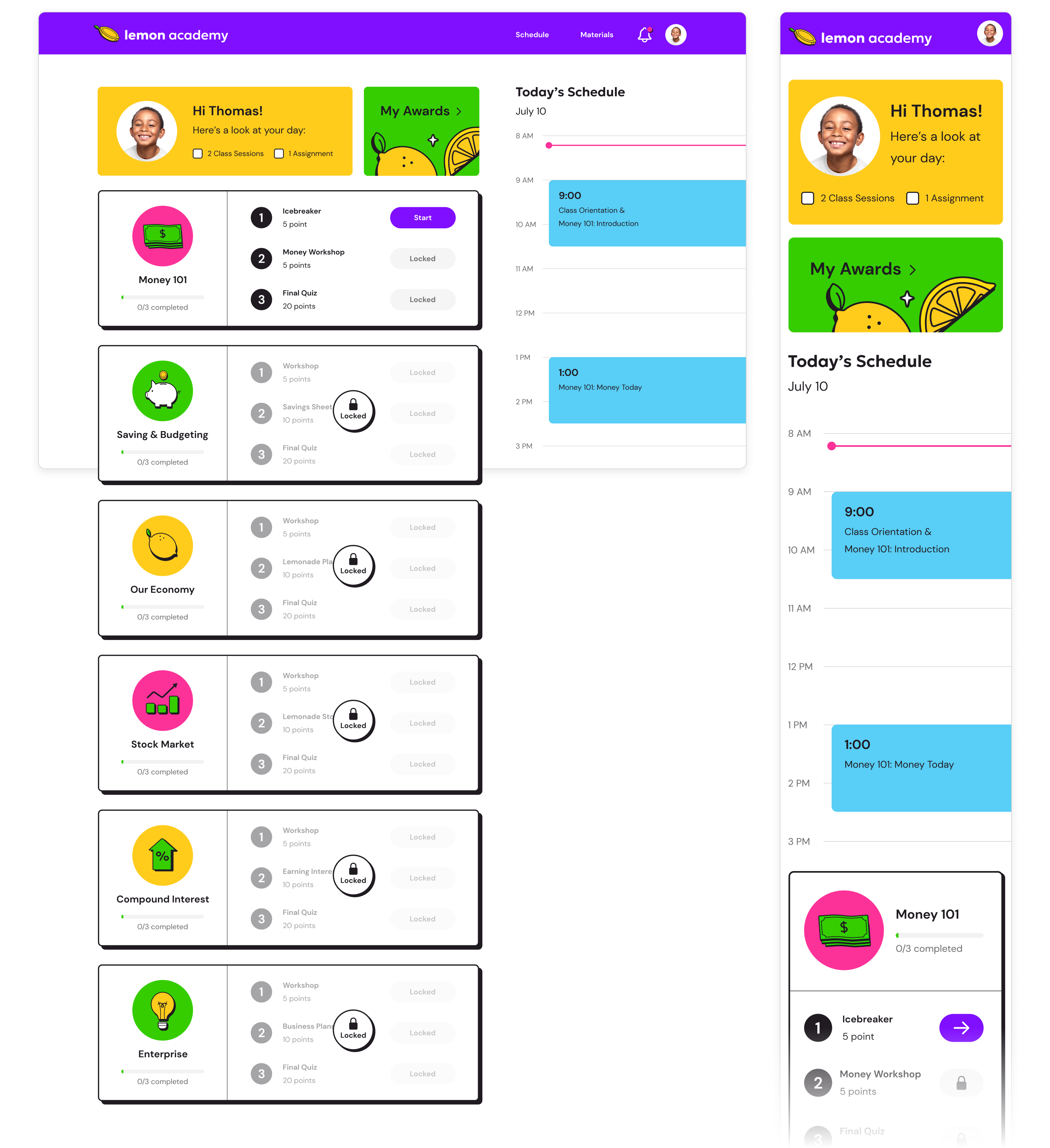
Student Dashboard
For the student dashboard, I aimed to design a simplified space that would allow students to access course materials, calendars, and assignments. Locking course materials that haven't been covered yet ensures students have a clear view of what needs immediate attention.
Applying the Brand
With the content accounted for, I moved on to applying the brand to high-fidelity designs, being mindful of a responsive experience that could translate to multiple interfaces.
In addition to applying brand colors and visuals, I combed through the original copy, updating a few things to align with the outlined tone of voice.
Landing Page
Student Dashboard
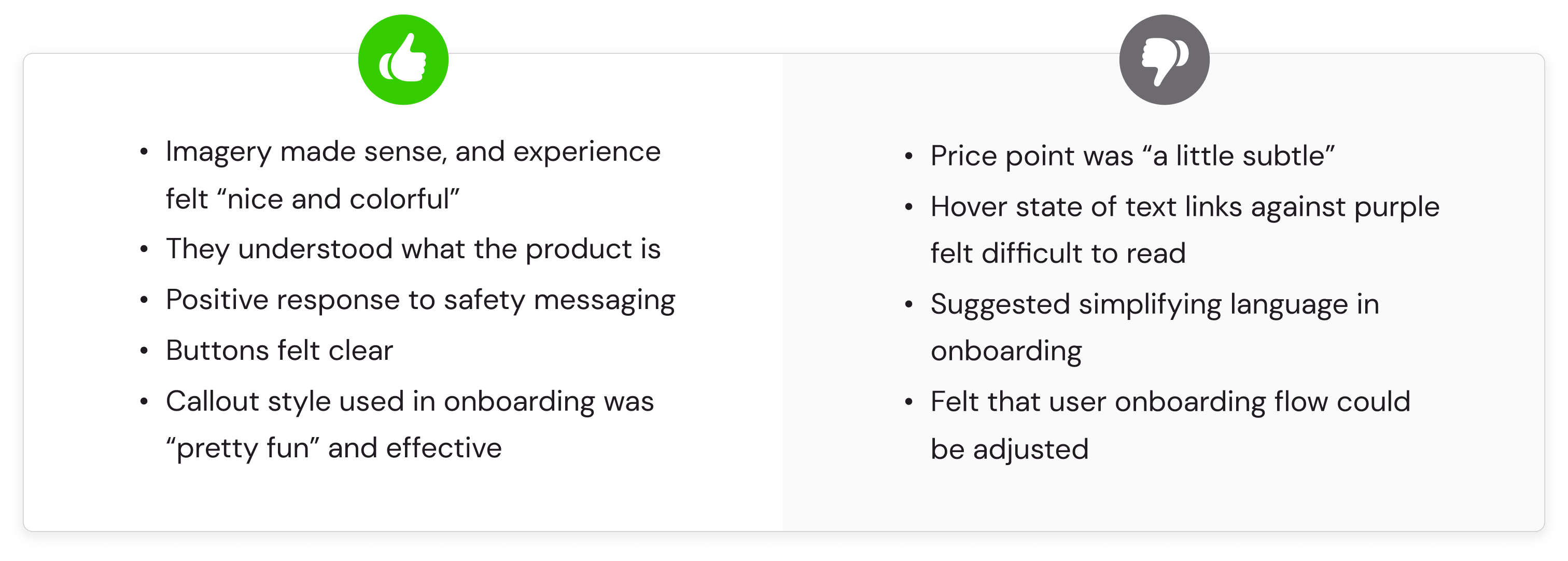
UI Testing
In order to understand the brand approach's effectiveness, I drafted a UI test plan and developed a prototype beginning from the landing page and ending at the student dashboard.
With the prototype, I planned to test relevant and willing participants, asking them questions to understand how appealing the brand approach was, how clear the messaging was, and how easy it was to identify artifacts such as buttons, text links, and form fields.
Task Scenario
You are a 10-year-old child recently enrolled in Lemon Academy by your parent. Class starts today, and you need to log into your account to onboard before your first class. Use the provided prototype to log in from the landing page and complete the onboarding walkthrough.
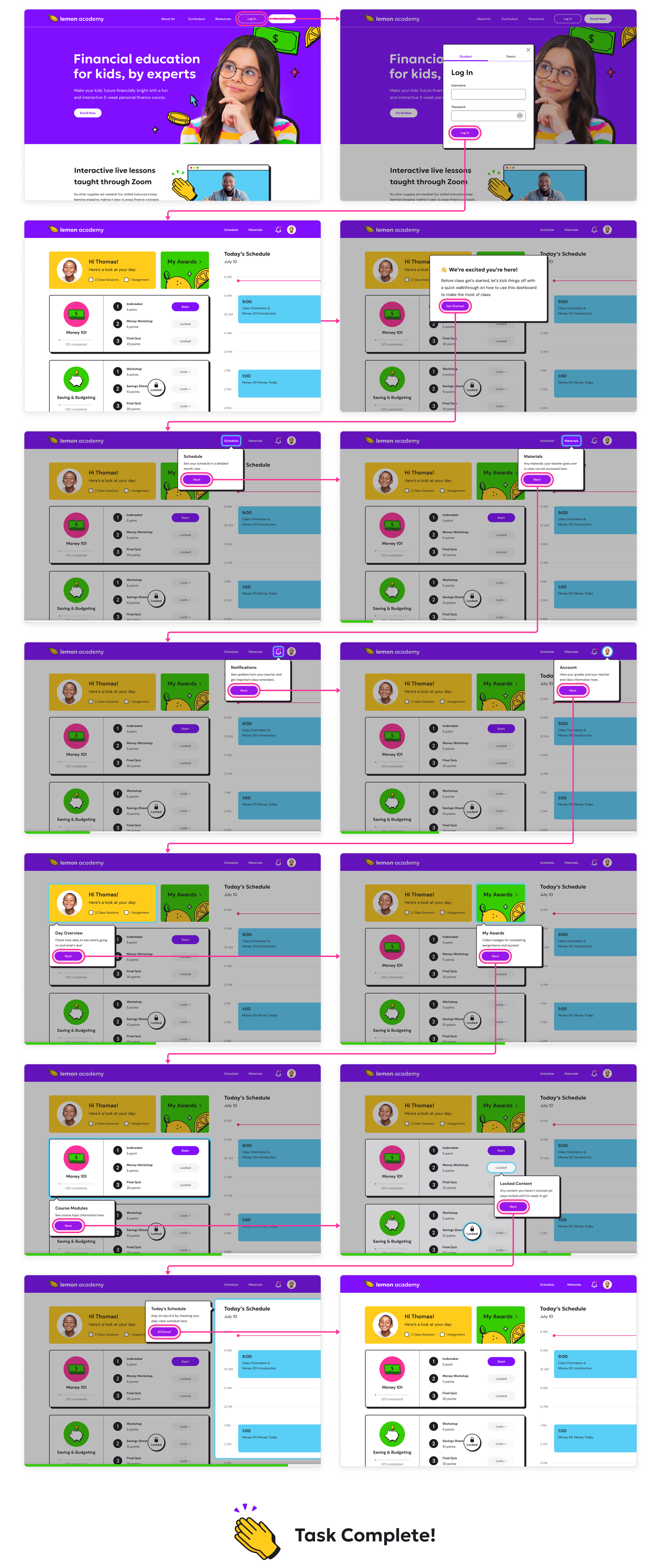
The success metrics for this test would benefit from quantifying several respondents' assessments of how satisfactory the UI felt for them. However, within the project scope, I was only able to test one parent.
Outcomes
Though results based on a singular UI test can't be considered conclusive, I gained valuable insight into what was and wasn't currently working with the brand approach and UI.
Overall, the visual approach seemed effective, and the copy was clear. However, further testing with children within the target age range for this product could greatly benefit the experience, ensuring that the copy, particularly on the student dashboard, is simple and comprehensive.
You can check out the final prototype below:
Takeaways
With a larger scope, I would have liked to spend more time exploring various brand approaches. And if I were to continue working on this project, I would plan for more user testing for parents and children. Conducting A/B tests regarding the landing page's structure and content could give us valuable insight into what the target audience gravitates toward and responds positively or negatively to. As an MVP, it would also be good to consider designing the UI and experience for the Parent's account and enrollment process.
With a project scope of 11 days comes plenty of "could've, would've, should've." While I can't say I'm unfamiliar with a tight timeline, I will say that this experience differed from others in that I was responsible for everything down to project management and scoping. I was surprised at the reality of the timeline I had set for myself and found myself working on nearly every deliverable in tandem with one another until the due date.
Expectations
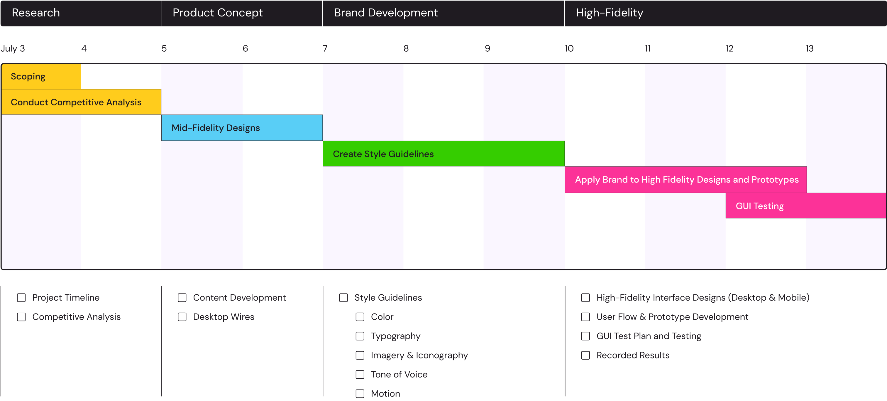
...vs. Reality
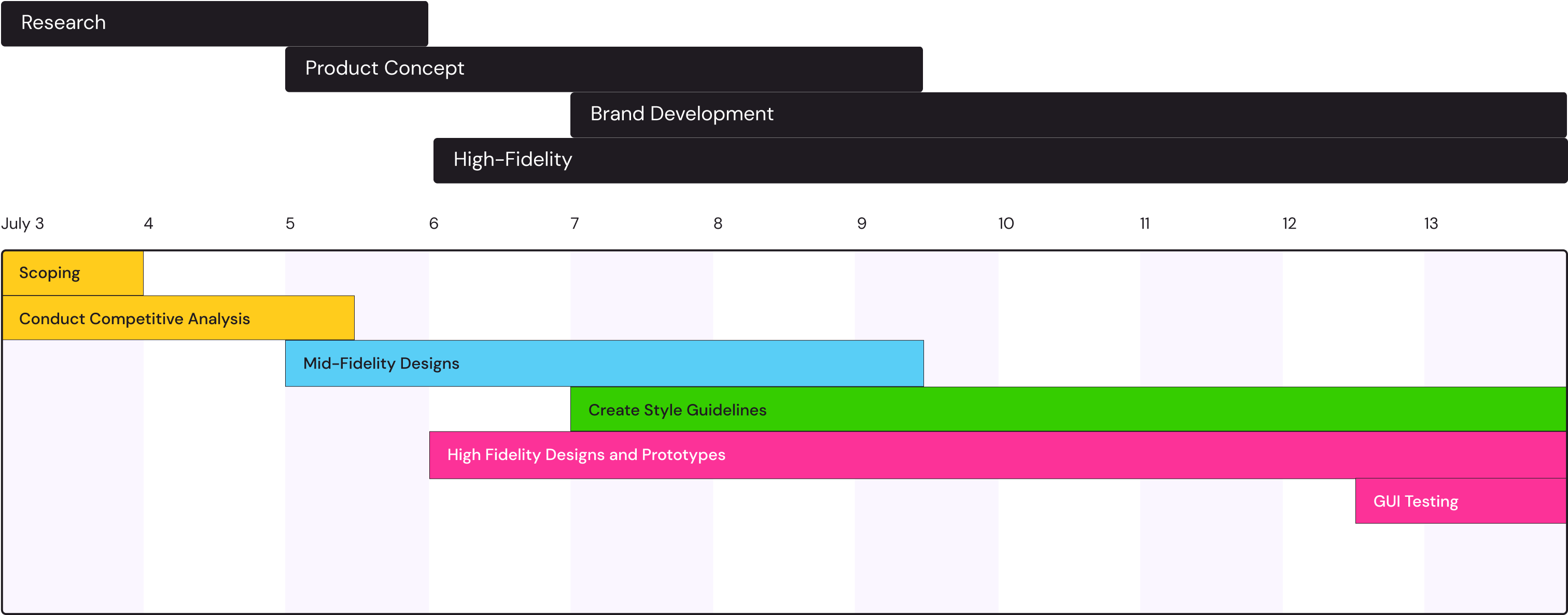
All that said, and while the project timeline may look like a mess, I'm proud of what I accomplished in such a short amount of time.