The AI Tool for Writers
Type: Student Project (Flatiron School)
Role: Product Designer, Art Director
Timeframe: 3 Week-Long Sprints
Today's marketers, content writers, and bloggers are often expected to produce quality work at a staggering pace; however, it can feel difficult to prioritize tasks or create valuable work.
HAYDN, an AI-powered app, aims to help writers work more quickly and efficiently, assisting them in crafting clear, persuasive, and authentic sentences with ease.
The Ask
Within the three week-long sprints, I worked on two projects for HAYDN, first creating mid to high-fidelity designs for a marketing page that would highlight HAYDN's features and drive brand engagement, and second, designing and testing high-fidelity app prototypes.
Responsibilities
Provided with brand materials, I was tasked with taking on the roles of UX and UI Designer and Art Director. The brand materials consisted of copy for the marketing page experience, color, typography, & image guidelines, a logo, and low-fidelity wireframes for the marketing page and mobile app interface.

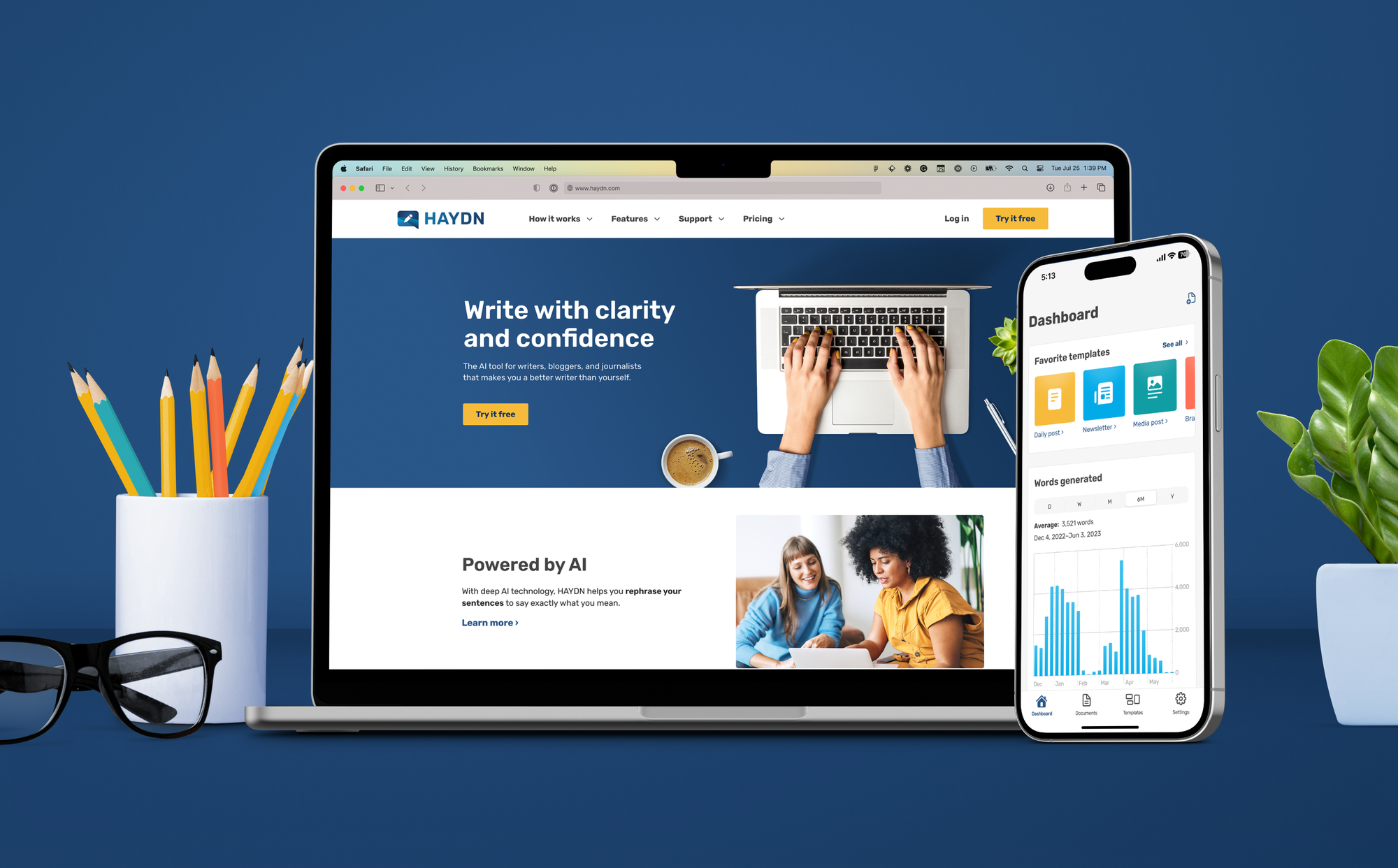
The Marketing Page
As I began the process of designing the marketing page experience, I realized two things: the provided low-fidelity wireframe was just that — low-fidelity and very much up to interpretation — and that I would need to be choosy with copy since an abundance of content was provided.
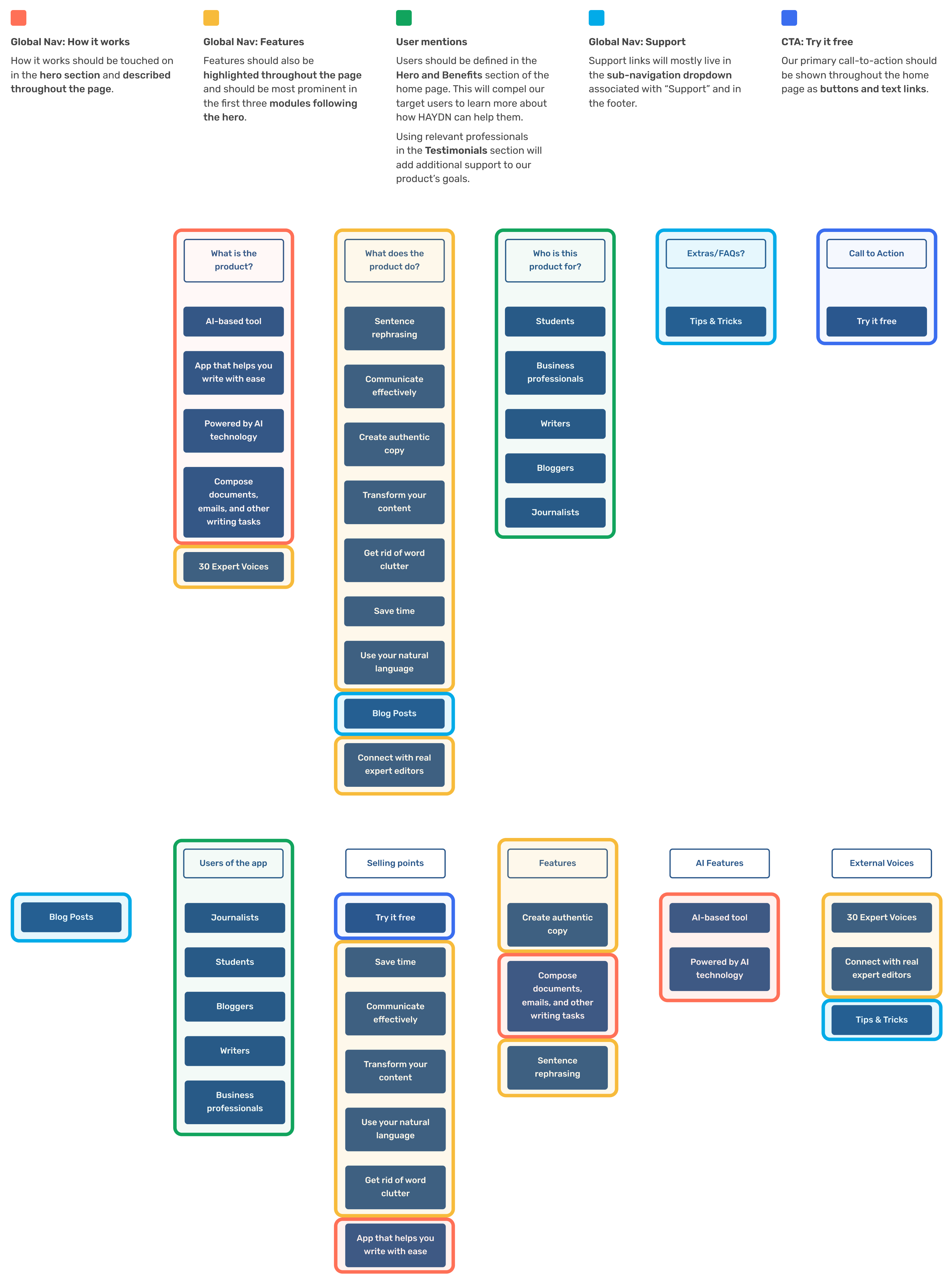
Using key messaging and concepts from the copy documents, I created an open card sorting exercise that I would later use on a few willing participants with the hopes that it would help inform how I could plan to create structure on the marketing page.
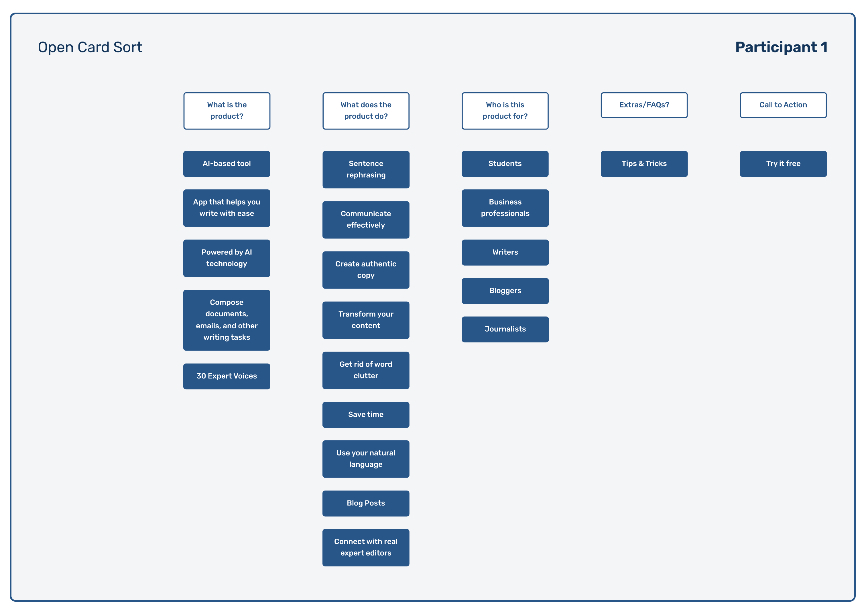
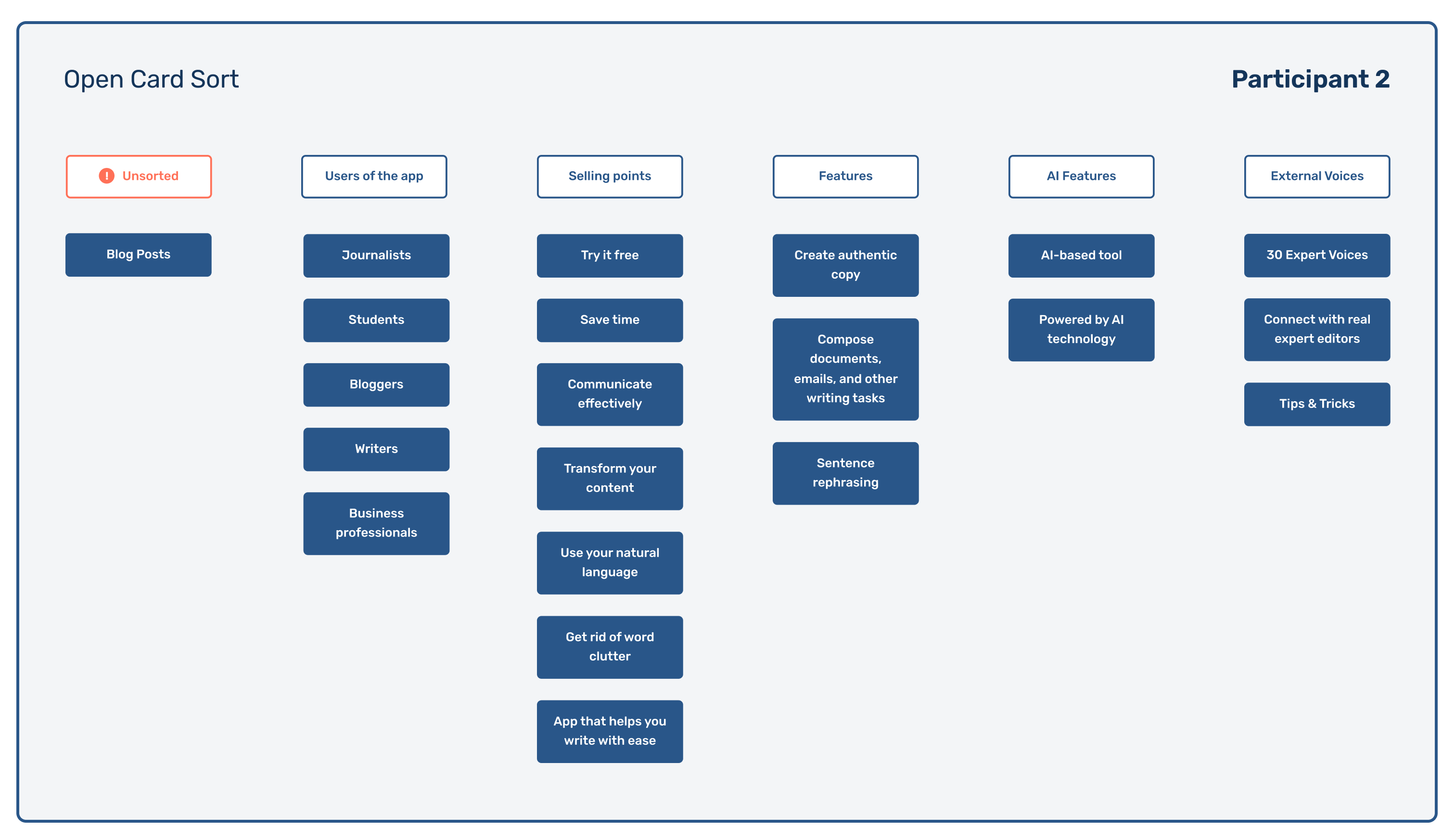
Through the open card sorts, I saw that content such as Blog Posts, Tips & Tricks, and 30 Expert Voices could use more context or that I could reconsider these labels to ensure clarity for site visitors.
Comparing and analyzing the participants' responses aided me in determining the flow of the marketing page and defining the site's global navigation.
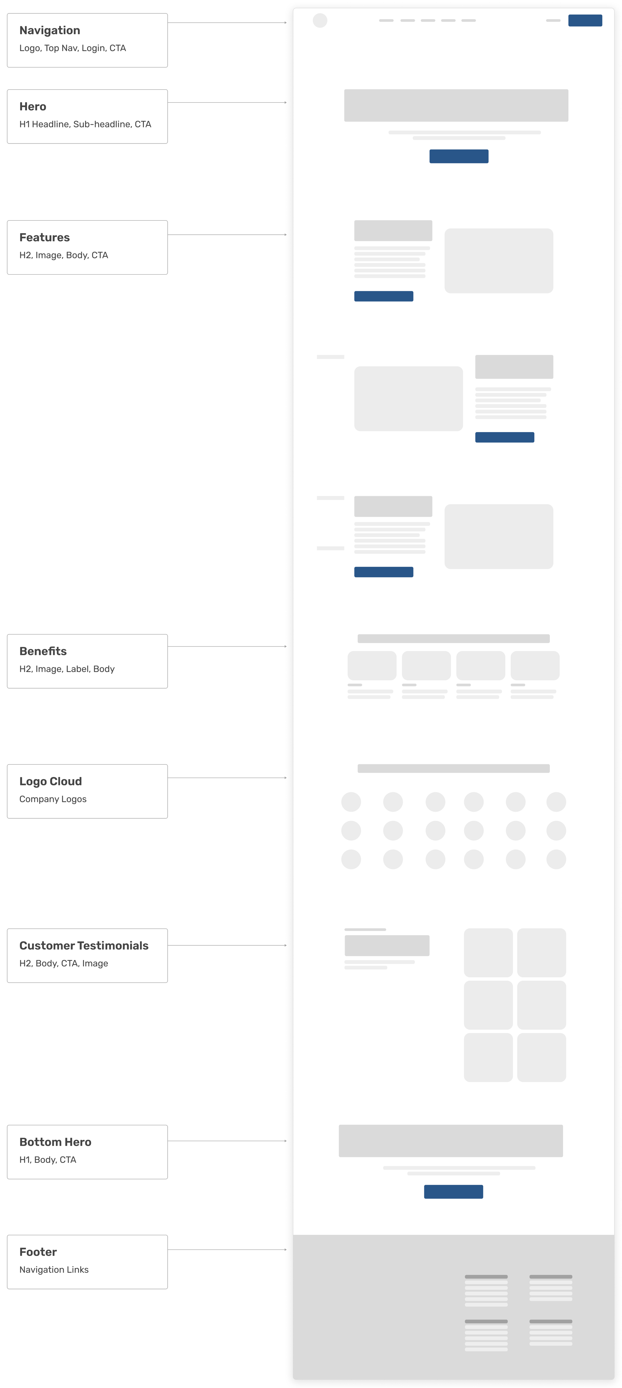
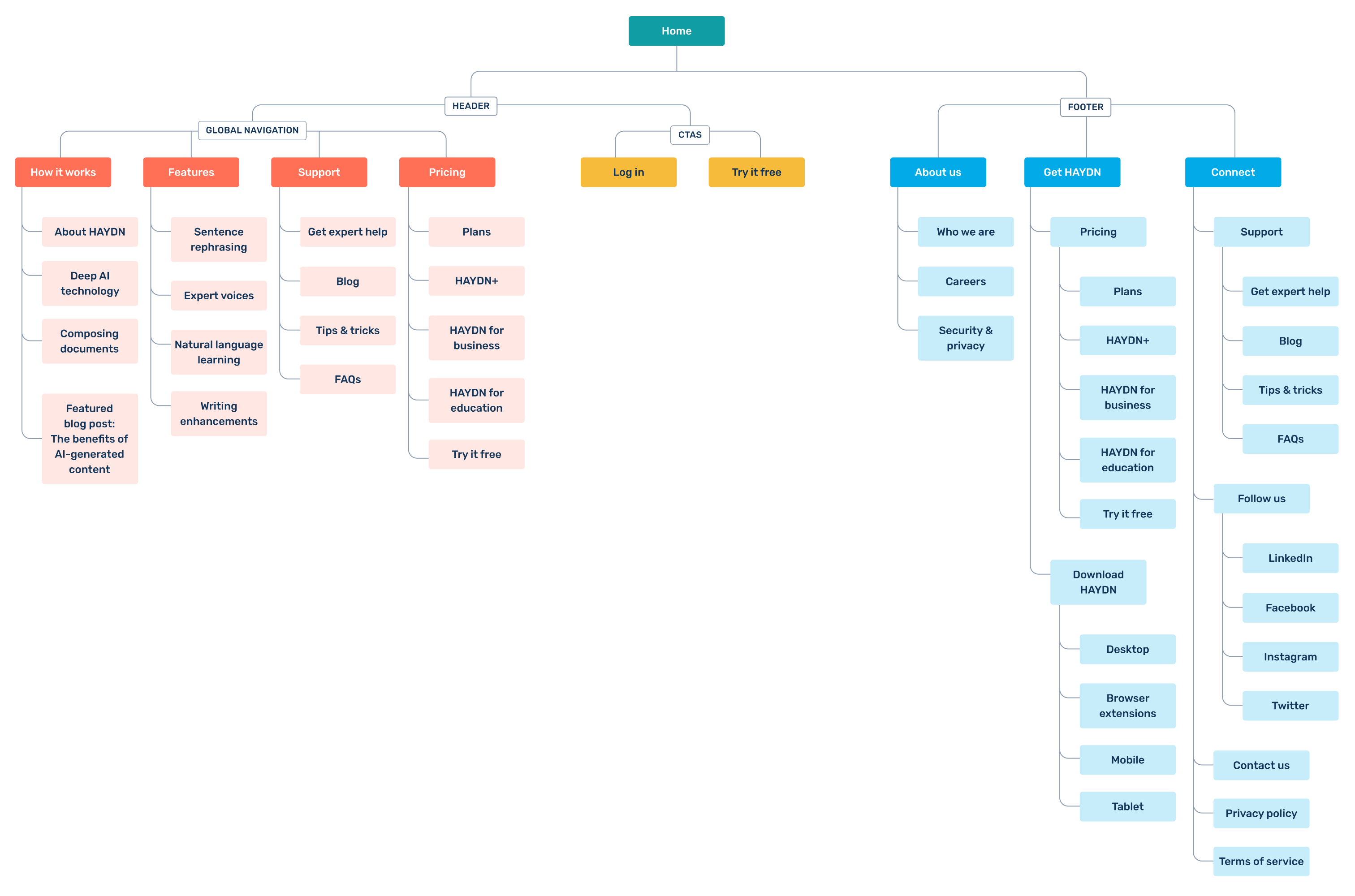
With all insights gained from the open card sort, low-fidelity wireframe, and copy documents taken into consideration, I created a site map that would aid in the next steps of the site's development.
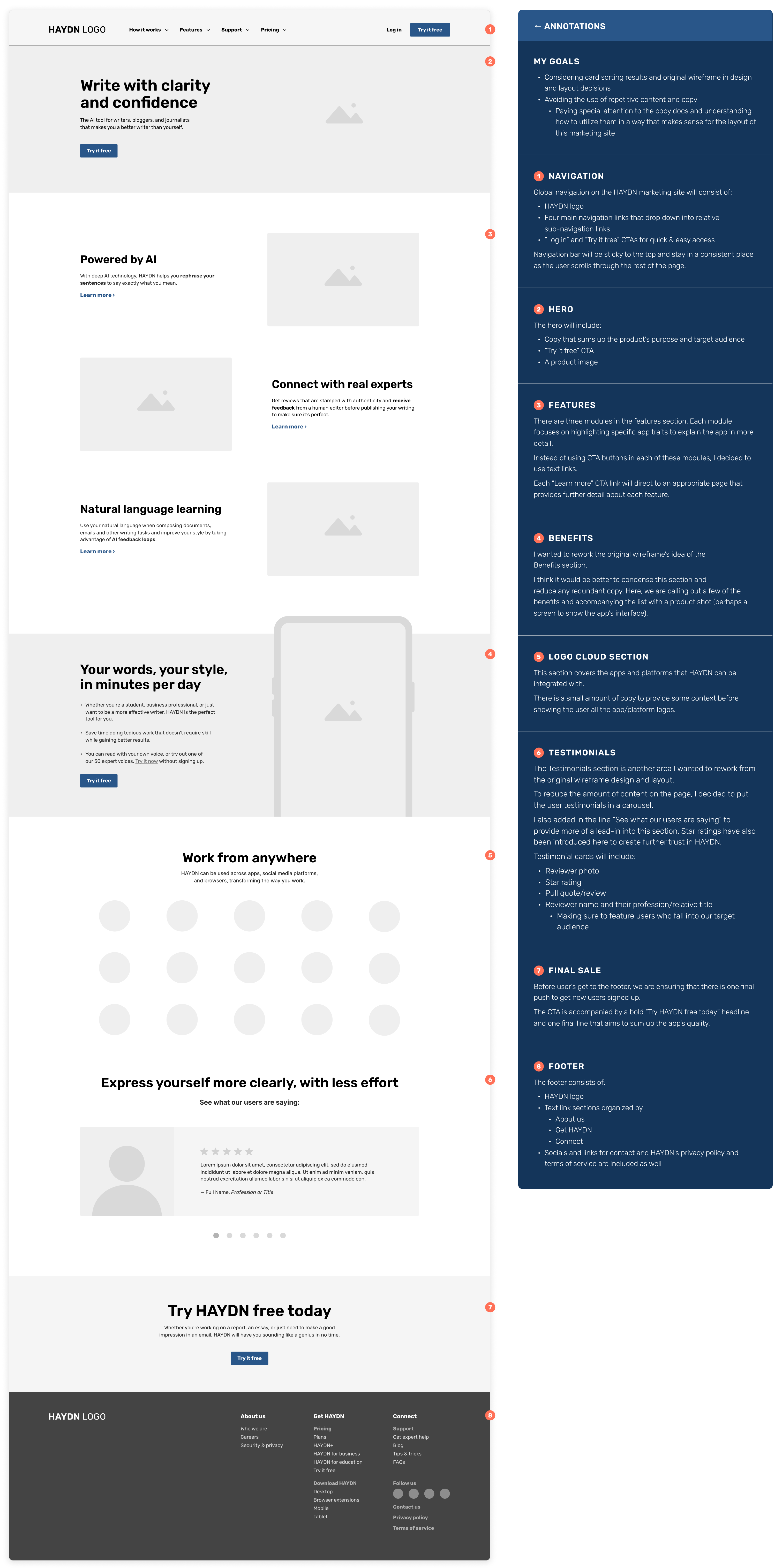
Mid-Fidelity
Taking the information found from the open card sorts and site map, I was ready to tackle the mid-fidelity wireframe. The heavy considerations toward copy choice and content flow in this stage would later prove to be useful steps that would ease me into the final designs.
High-Fidelity
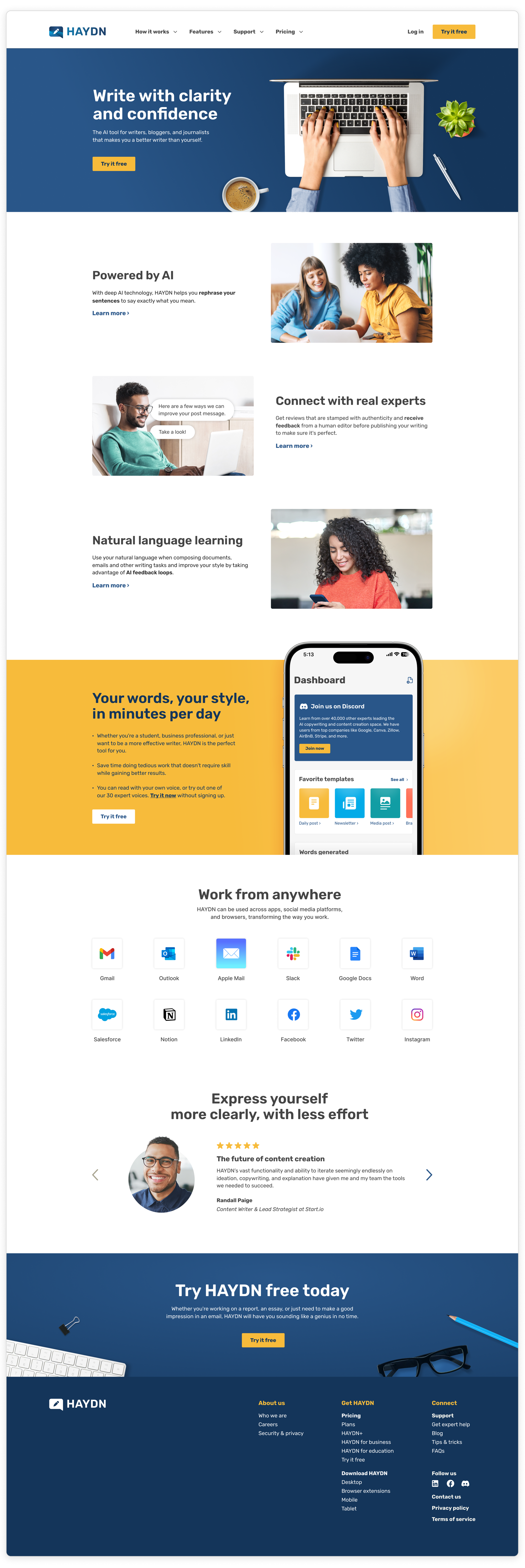
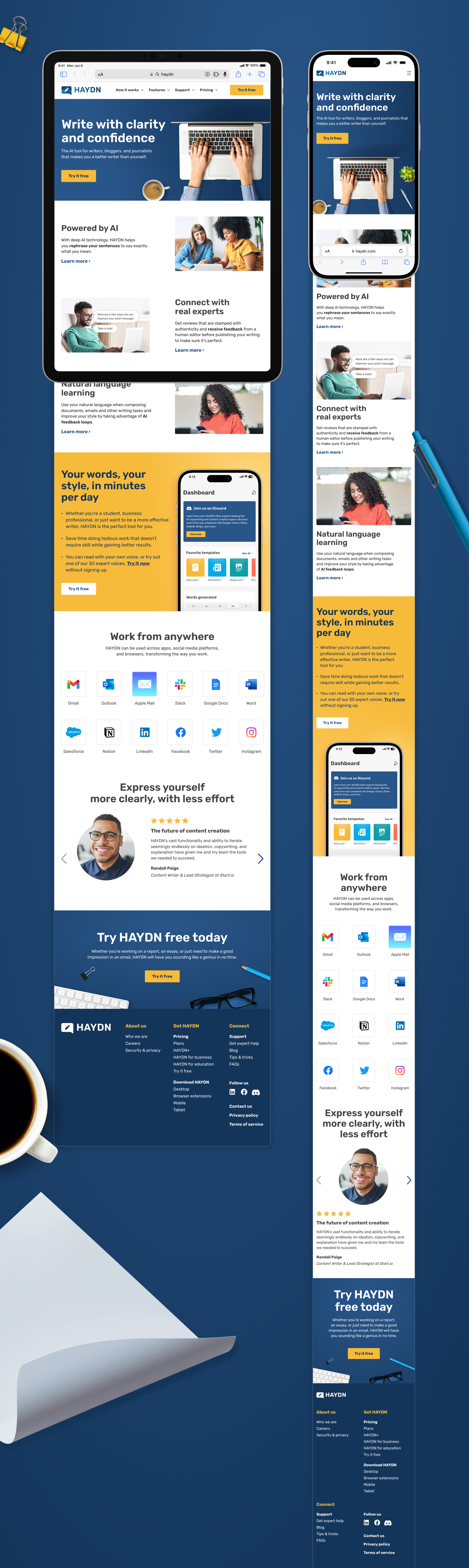
When considering the final high-fidelity design for the marketing page, I looked back at the colors and provided notes on imagery.

To capture the warmth and diversity described by the guidelines, I sourced images of young adults placed in real work settings and top-down desktops that felt modern, tidy, and professional to speak to the aspirational side of who the target audience is or aims to be.
Each brand color was also tested for contrast ratios, helping to define which colors would be best for text and CTA usage, ensuring accessibility for all.
To maximize outreach to potential users, considerations toward a responsive experience were important for the marketing page. Mobile and tablet layouts are shown below.
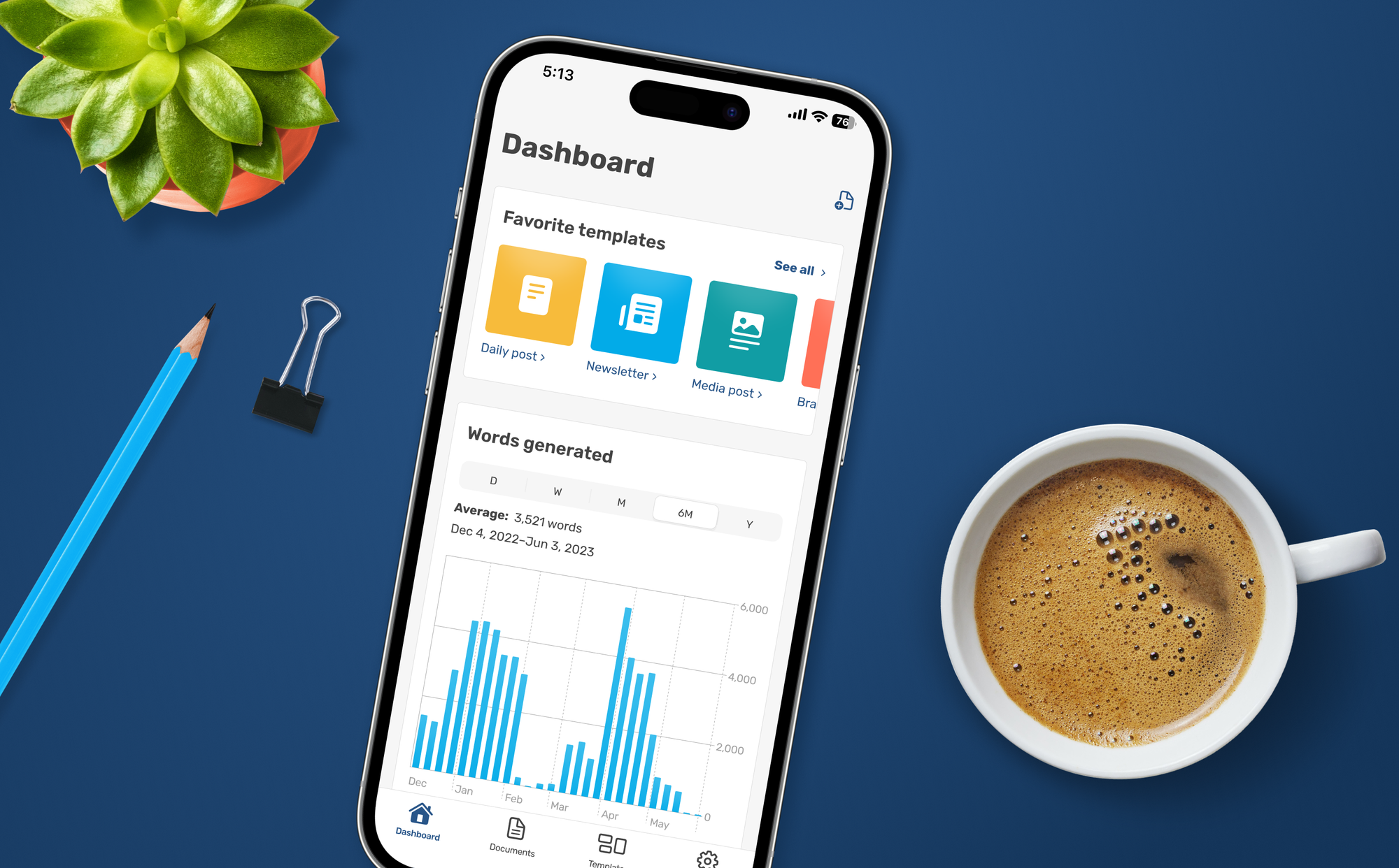
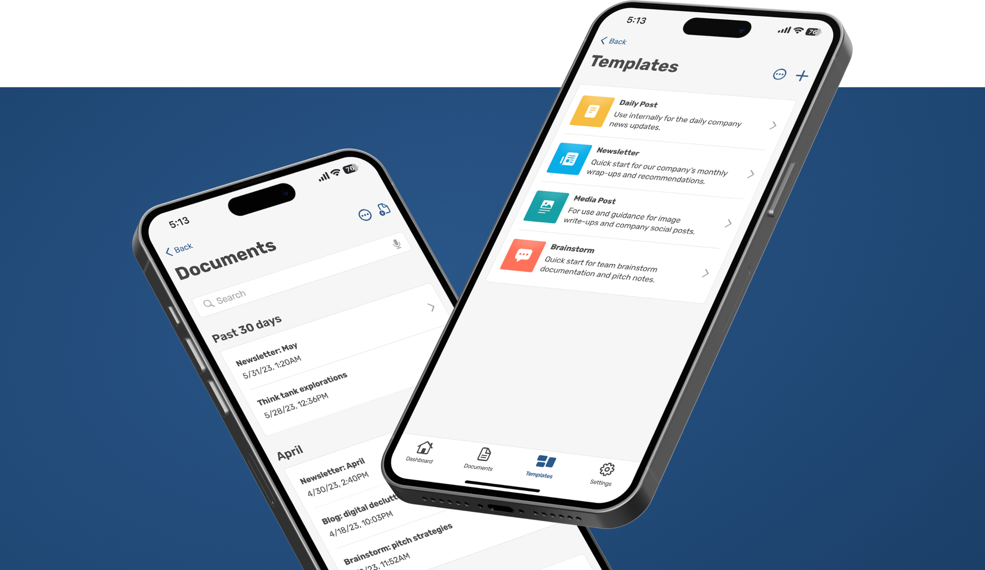
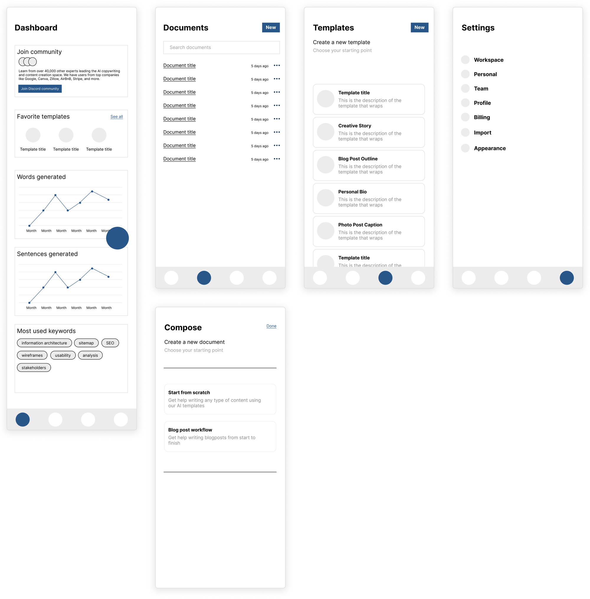
The App Interface
With the below-provided low-fidelity app wireframes, I set off to create a set of app prototypes that would later be tested by participants falling into HAYDN's target audience.
The Result
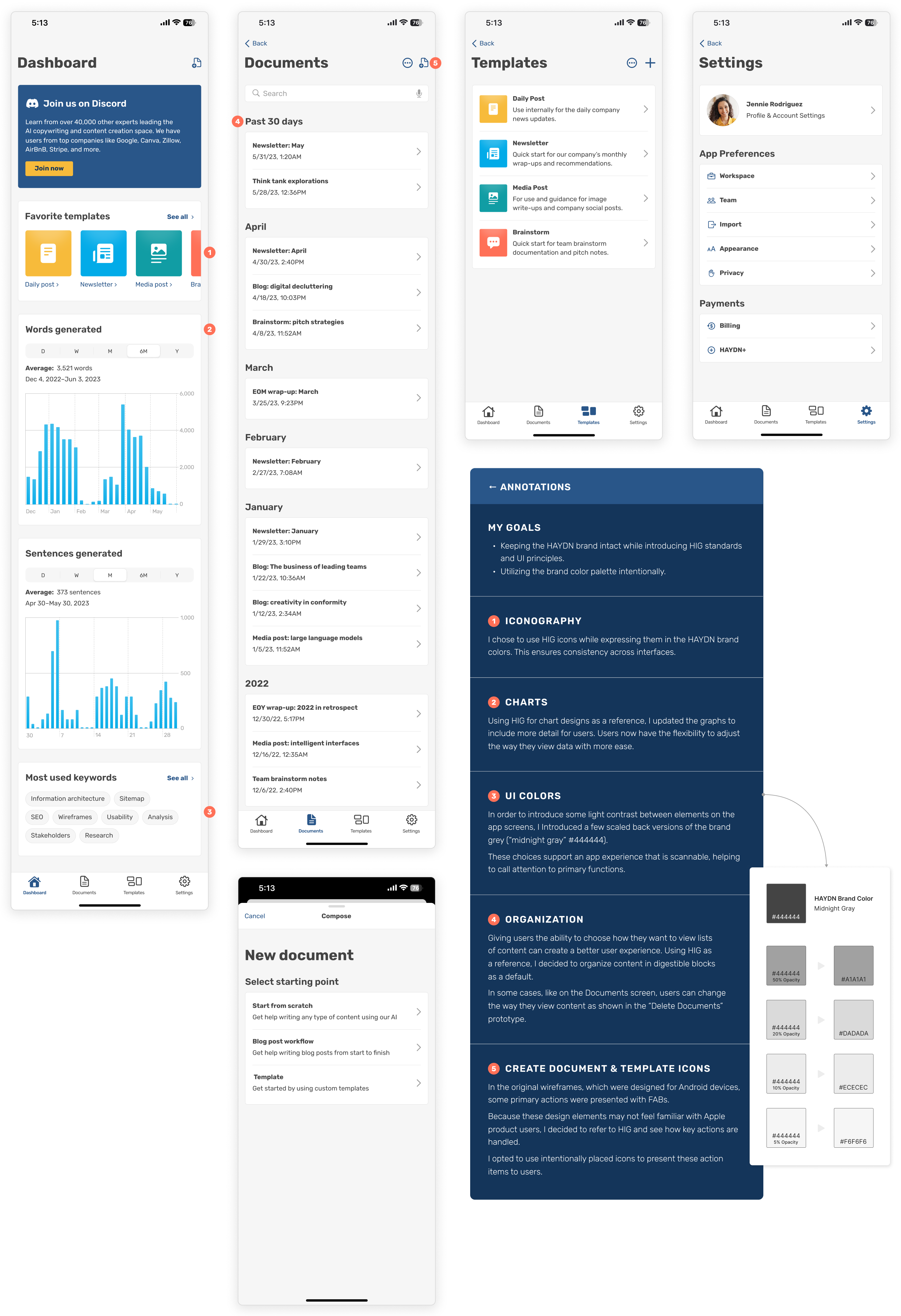
While developing the app interface, I aimed to create an iOS experience using the best practices defined by Apple's Human Interface Guidelines (HIG). Brand colors were used intentionally and sparingly to make key actions stand out.
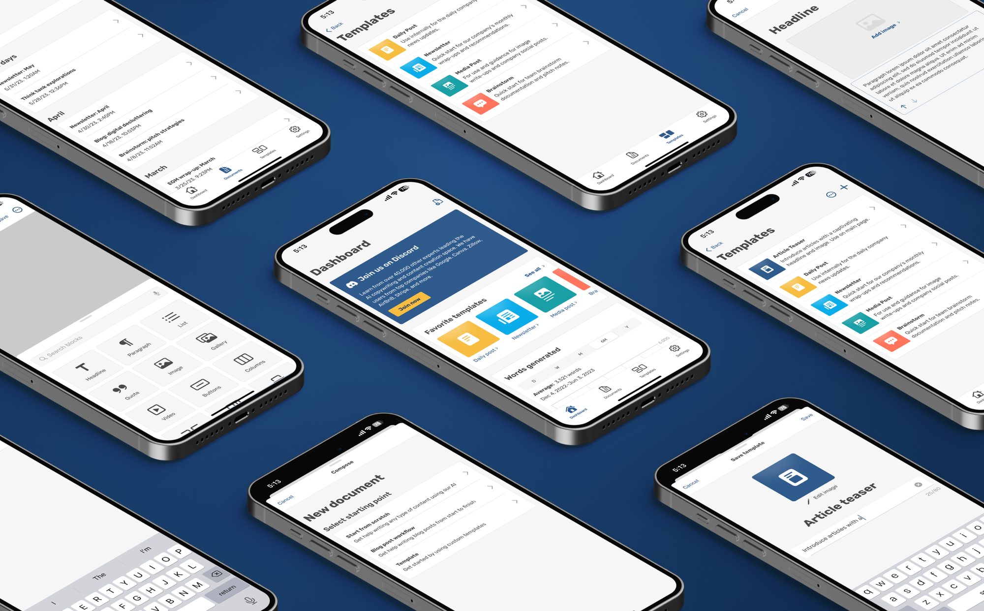
Task Flows and Prototyping
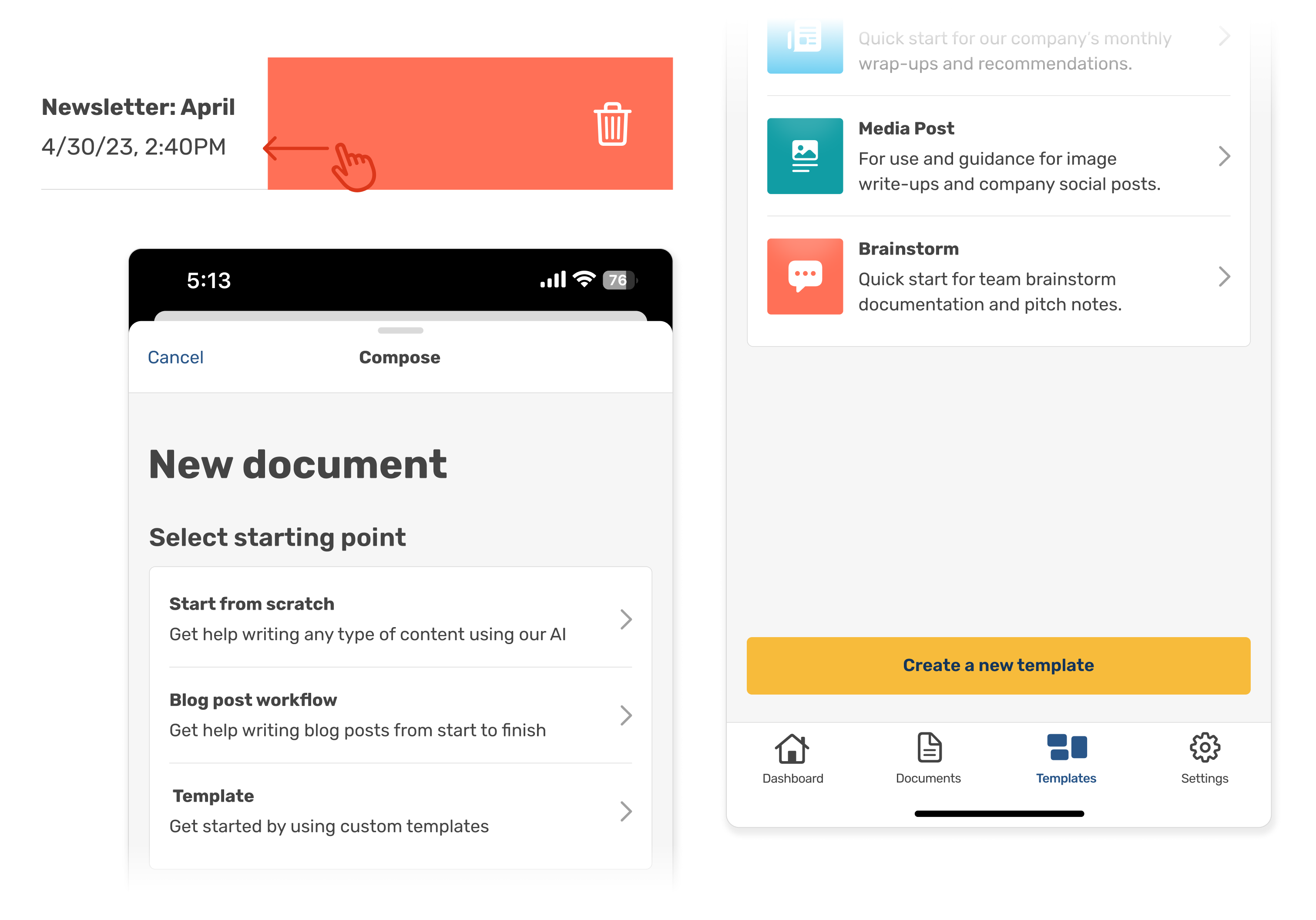
To identify and understand the app's successes and failures, the creation of 3 user task flows was executed, each tied to a critical user action:
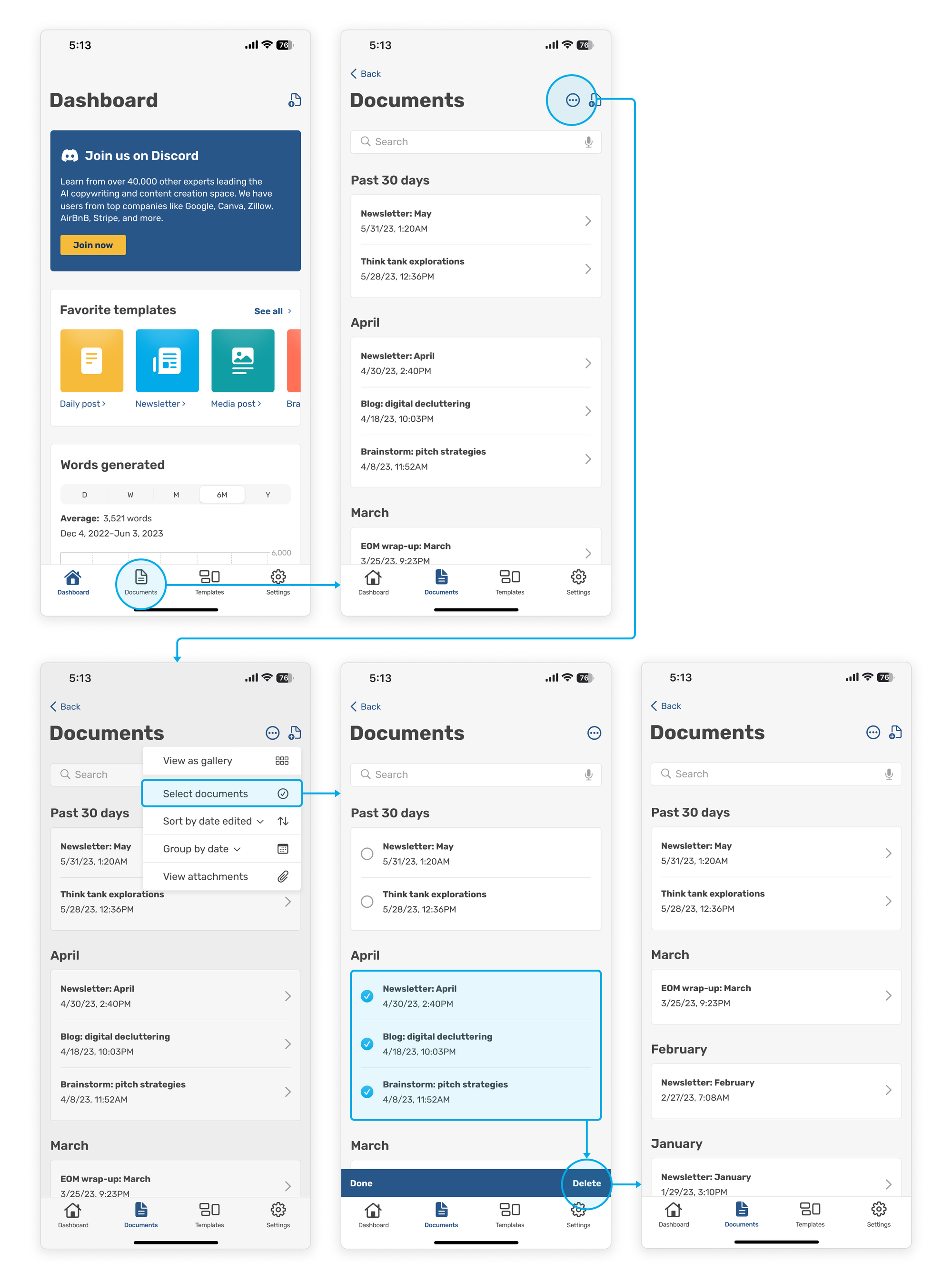
• Deleting documents
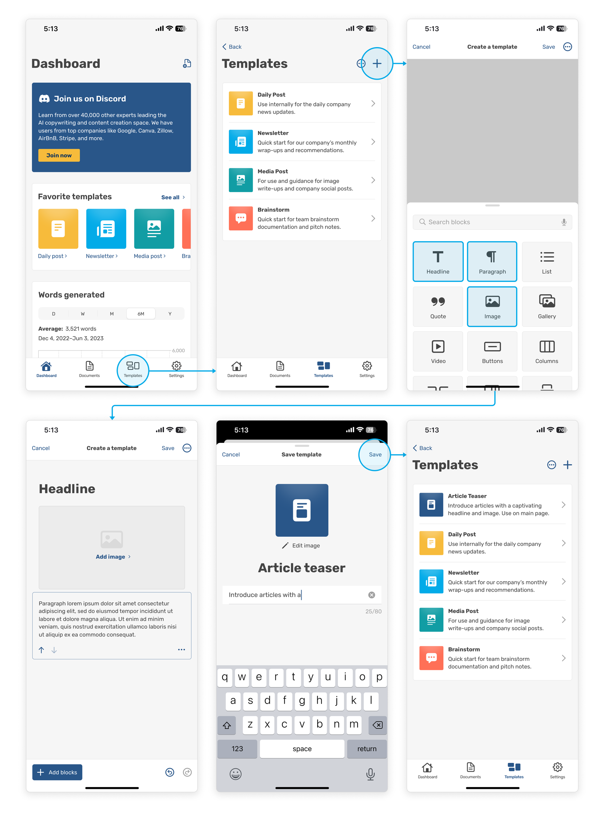
• Creating a template
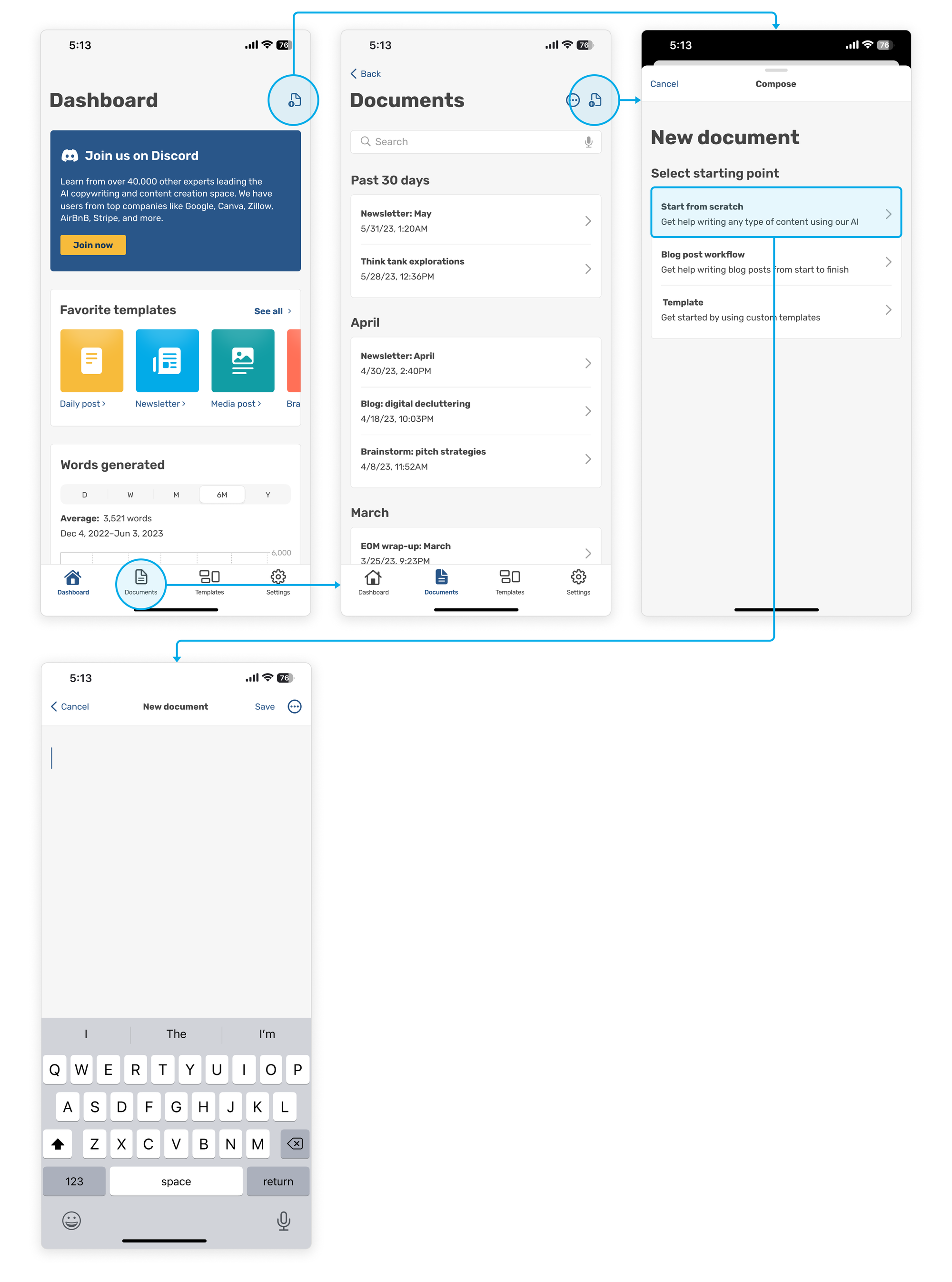
• Creating a new document
Establishing a base understanding of the successes and failures of the current design and copy decisions would inform how we could plan to improve and proceed in the next steps.
Task Scenario 1
You work as a professional blogger. You've recently noticed that the articles you published in April now feature outdated information, and you want to ensure you refrain from referencing them in future work. Use the HAYDN app prototype to delete documents from April.
Task Scenario 2
As a content manager, you must streamline common content your company releases.
Use the HAYDN app prototype to create a new template consisting of the following:
• A headline
• An image
• And paragraph copy
Task Scenario 3
You work as a copywriter. On your commute home on the train, you think of a few possible copy solutions for your current project.
Use the HAYDN app prototype to create a new document that can be used to record your ideas quickly.
User Testing and Results
With the prototypes accounted for, I moved into the last phase to assess the effectiveness of the user interface's objective goals of document and template creation and editing.
The main goal of conducting these usability tests was to identify any problems or user hurdles regarding the navigation of the app interface.
Participants were provided high-fidelity prototypes and asked to accomplish the three established task scenarios in person in 1-on-1 unmoderated sessions. As participants navigated the prototypes, they were asked to narrate their thoughts and actions.
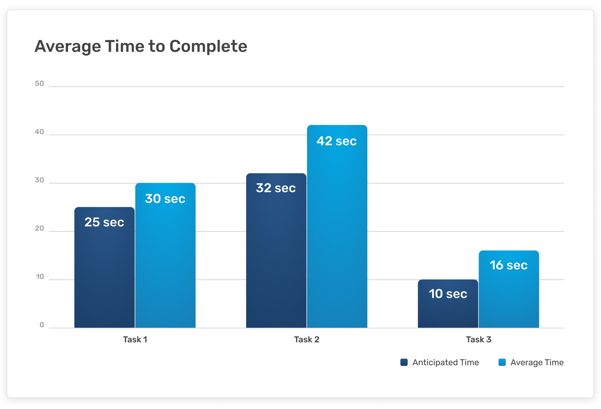
Success Metrics
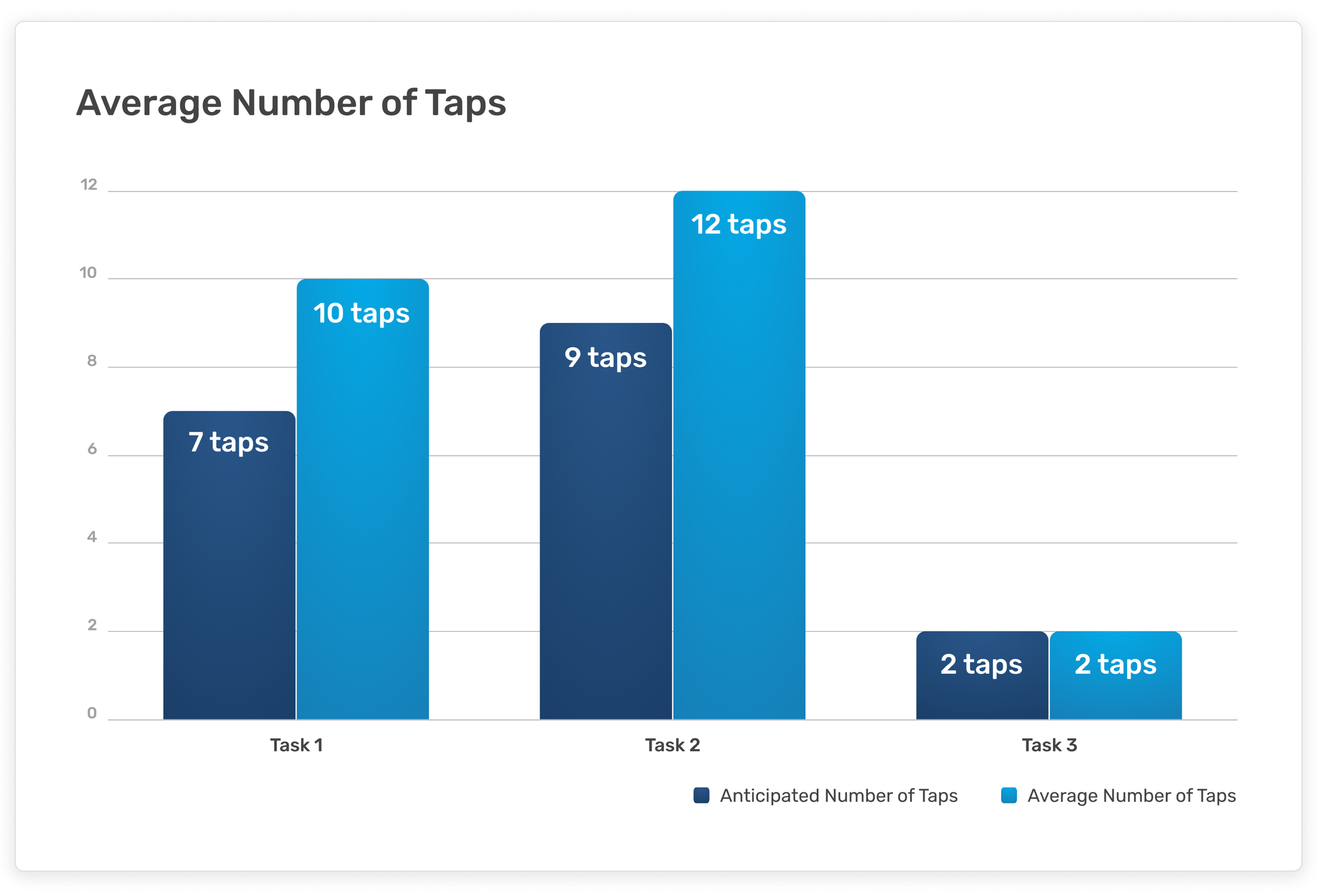
Comparing participant results to hypothesized metrics regarding task completion time and the total number of interface interactions taken throughout the user test (quantified by taps) offered a less abstract way to define the app interface's success.
Observations
Participants were able to complete the tasks themselves and expressed satisfaction with the interface's overall look and feel. The anticipated number of taps for creating a new document also matched the participants' average number.
Conversely, completion time across all tasks ran higher than anticipated. This could be a fault of the task scenario or the interface designs and iconography usage. Participants seemed to expect alternatives to document deletion, resulting in more taps to completion.
Finally, in creating a template, participants seemed to seek a more distinct call to action.
Recommendations
Based on the usability tests and recorded observations, the following adjustments may help to improve the interfaces and future usability tests:
• Enable swiping to delete documents and templates.
• Consider including a button for template creation.
• Alternatively, explore ways to call more attention to primary actions.
• For task scenario 3, consider being more specific about what kind of document participants should create.
Takeaways
This being my first larger project completed at Flatiron School, I learned that no project can ever really be declared "done" or "complete" — and that that is totally okay! There is such a difference between art direction and product design in that there is a greater emphasis on continually gathering and implementing user feedback in order to find success in a product.
In an alternate universe with a longer project scope, I would have loved to test more relevant users and continue collecting data. I would also continue to develop other app features, such as the user settings screens, and create task scenarios and usability tests to assess each feature's value.