Supporting Families in Making Confident School Decisions
Type: Student Project (Flatiron School)
Role: Product Designer, Art Director, Illustrator
Timeframe: 3 Week-Long Sprints
When deciding on the right school for their children, parents often struggle with identifying schools that align with their family’s wants and needs.
Tasked with simplifying this process, Better School Choice aims to understand what families need most and how to effectively equip them with the necessary tools to make confident decisions.
Goals
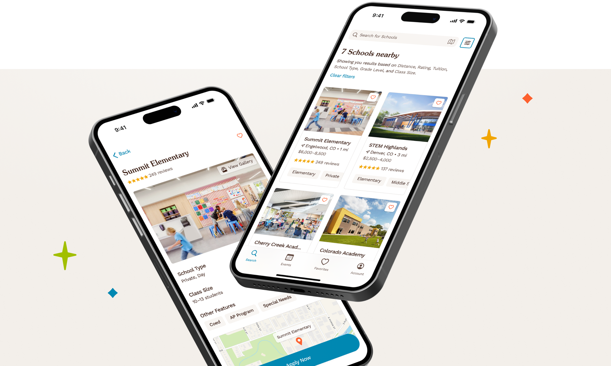
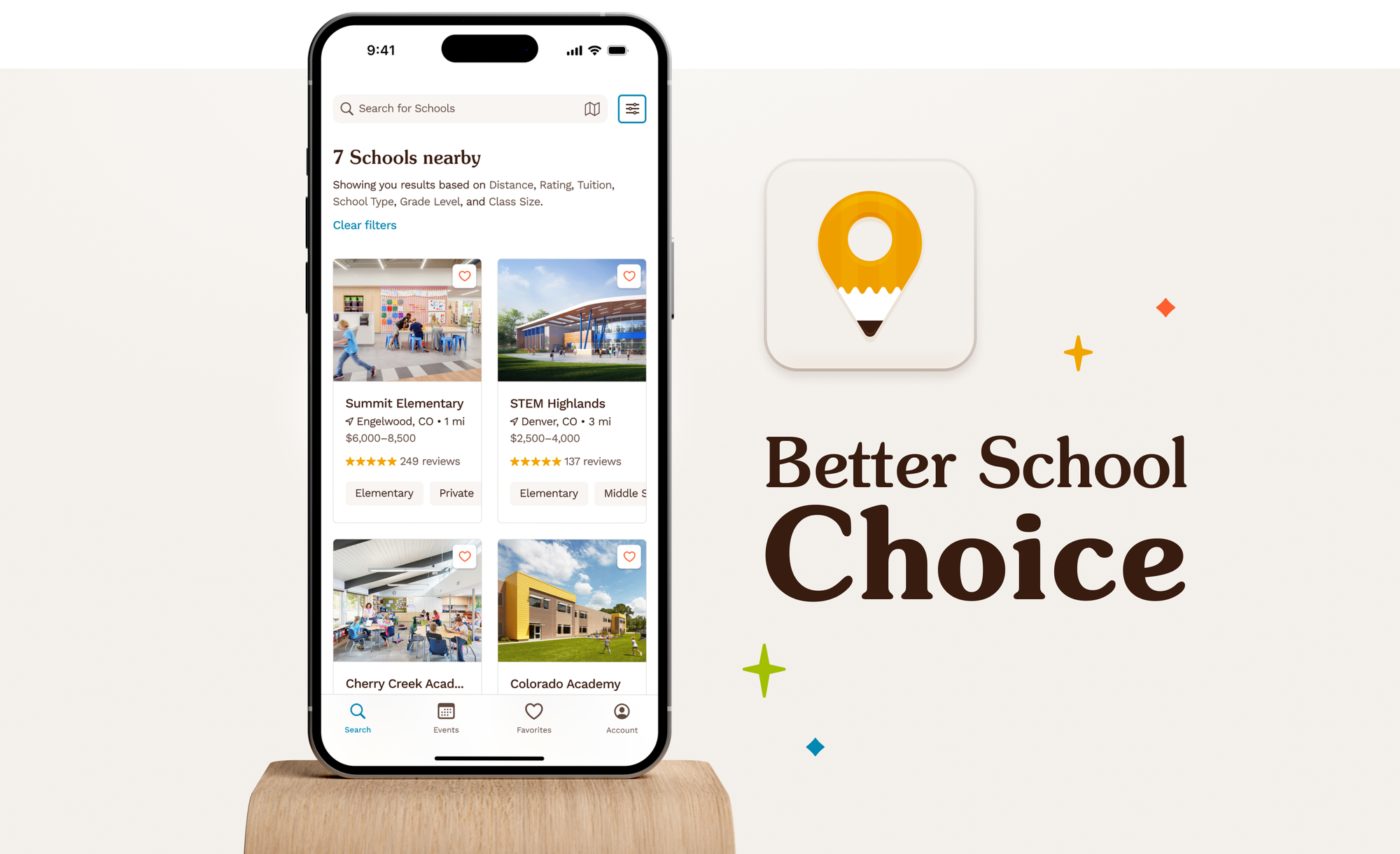
Consolidating key resources in a singular app where parents can search, favorite, and track compelling prospects can ease the process and make school searching an effortless experience.
Responsibilities
I was tasked with taking on the roles of User Researcher, UX and UI Designer, and Art Director. It is, however, important to note that the interview transcripts were conducted and provided by OurKids.
Defining "Who"
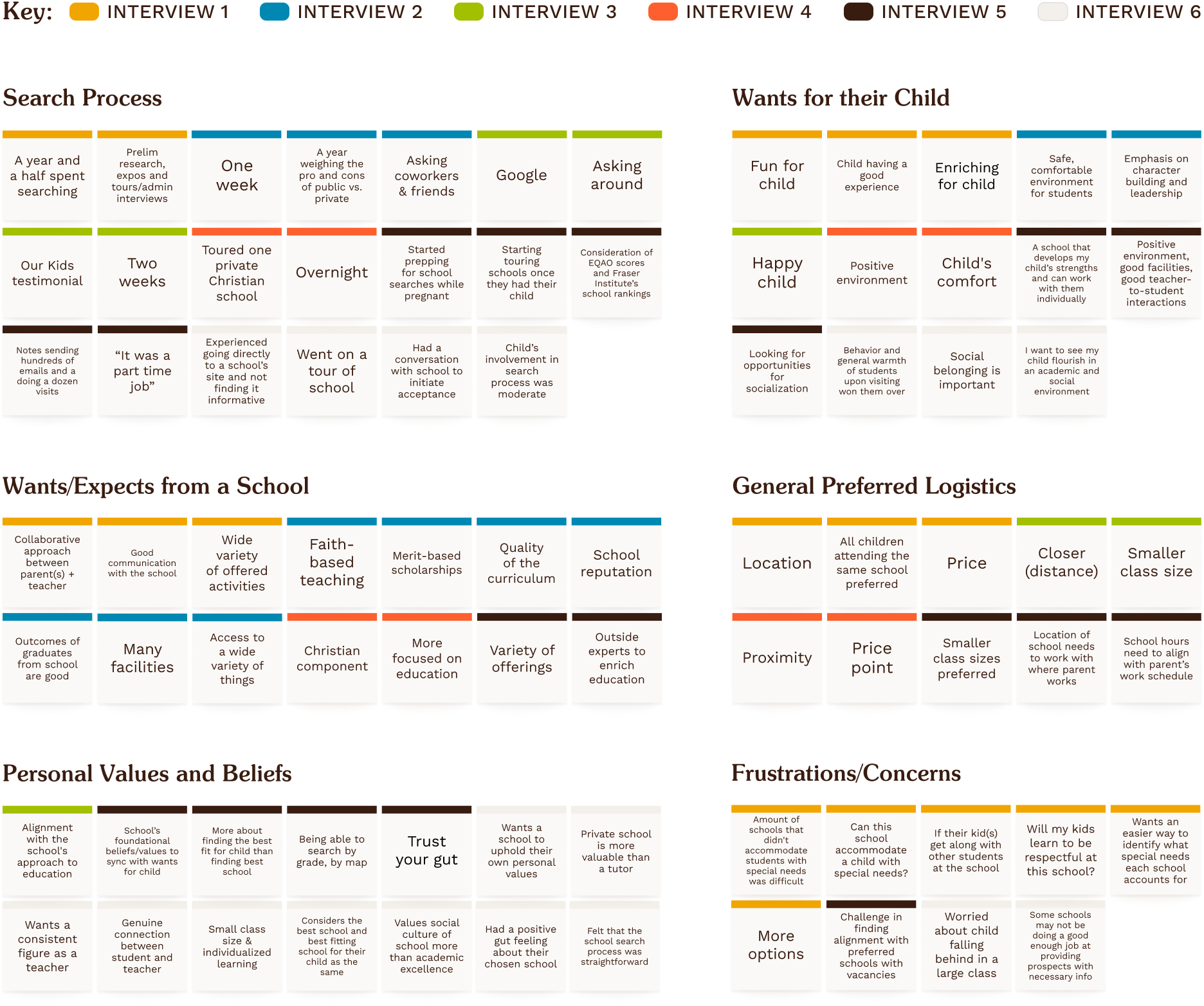
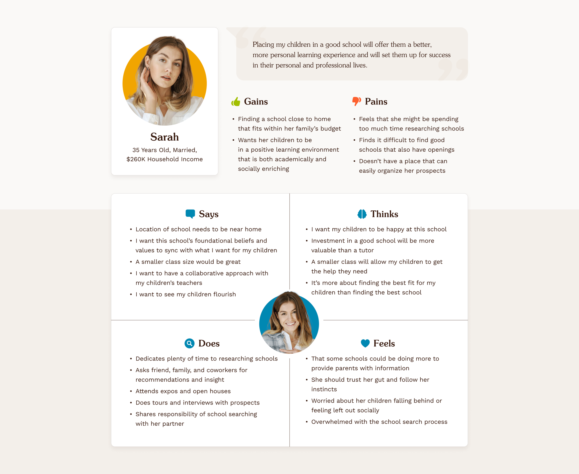
Analyzing six parent interviews provided insights into the target audience, defining who they are, how they feel, and what they need. An affinity diagram informed by the interviews, empathy mapping, and persona creation outlined Better School Choice’s target audience as parents of school-aged children.
Asking "How can we help?"
In addition to gathering insights into the target audience, a competitive analysis was conducted to inform what features Better School Choice might consider and what pitfalls could be avoided.
Key insights from these analyses are as follows:
• A unique brand, account features, and comprehensive school details help differentiate and bring value to users.
• Avoid content that is too visually or logically dense. Better School Choice should aim for approachability.
• The interjection of sponsored posts in search results can feel disruptive and negatively impact our users’ experience.
• The implementation of distinct features can support the product’s growth in the market.
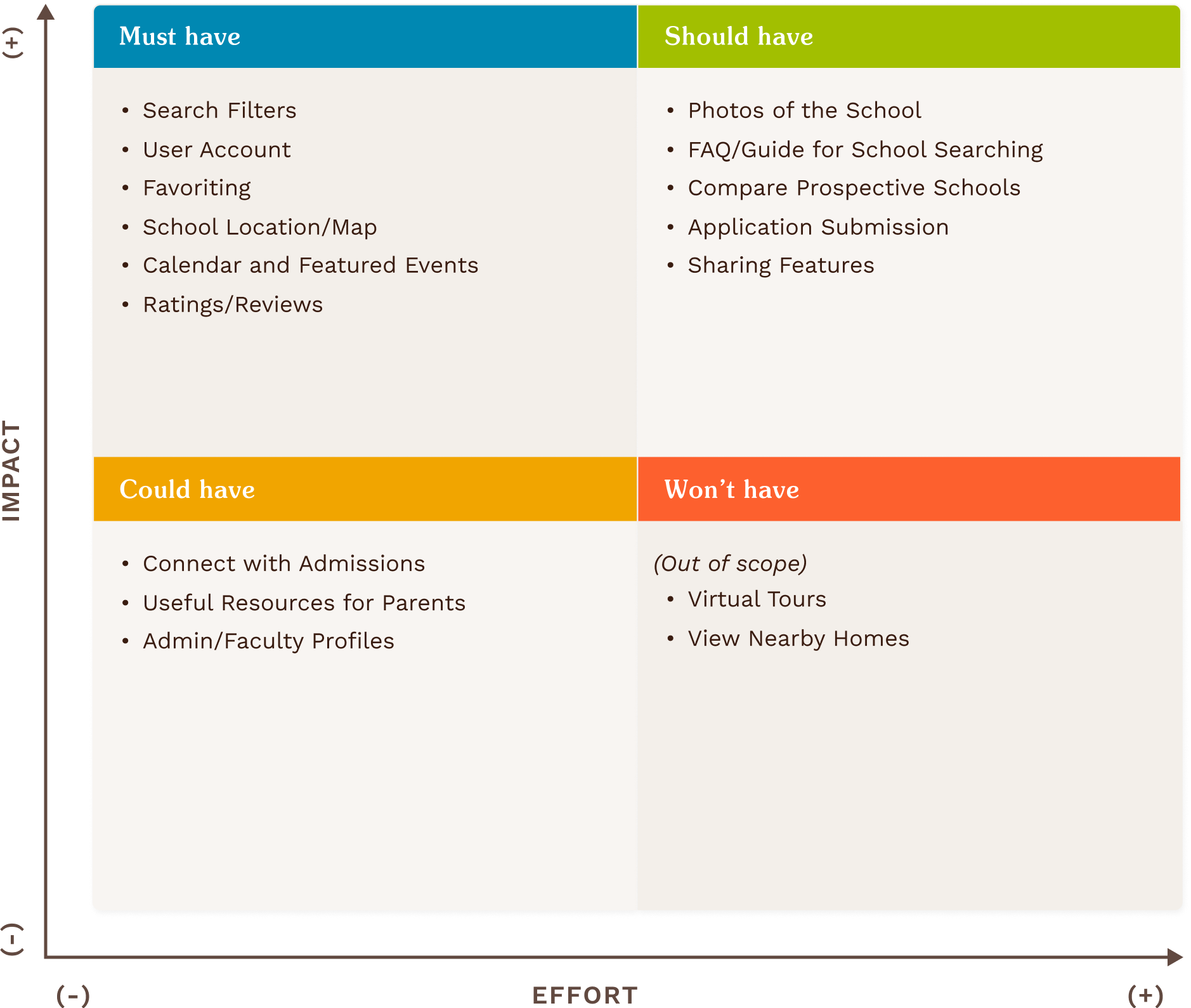
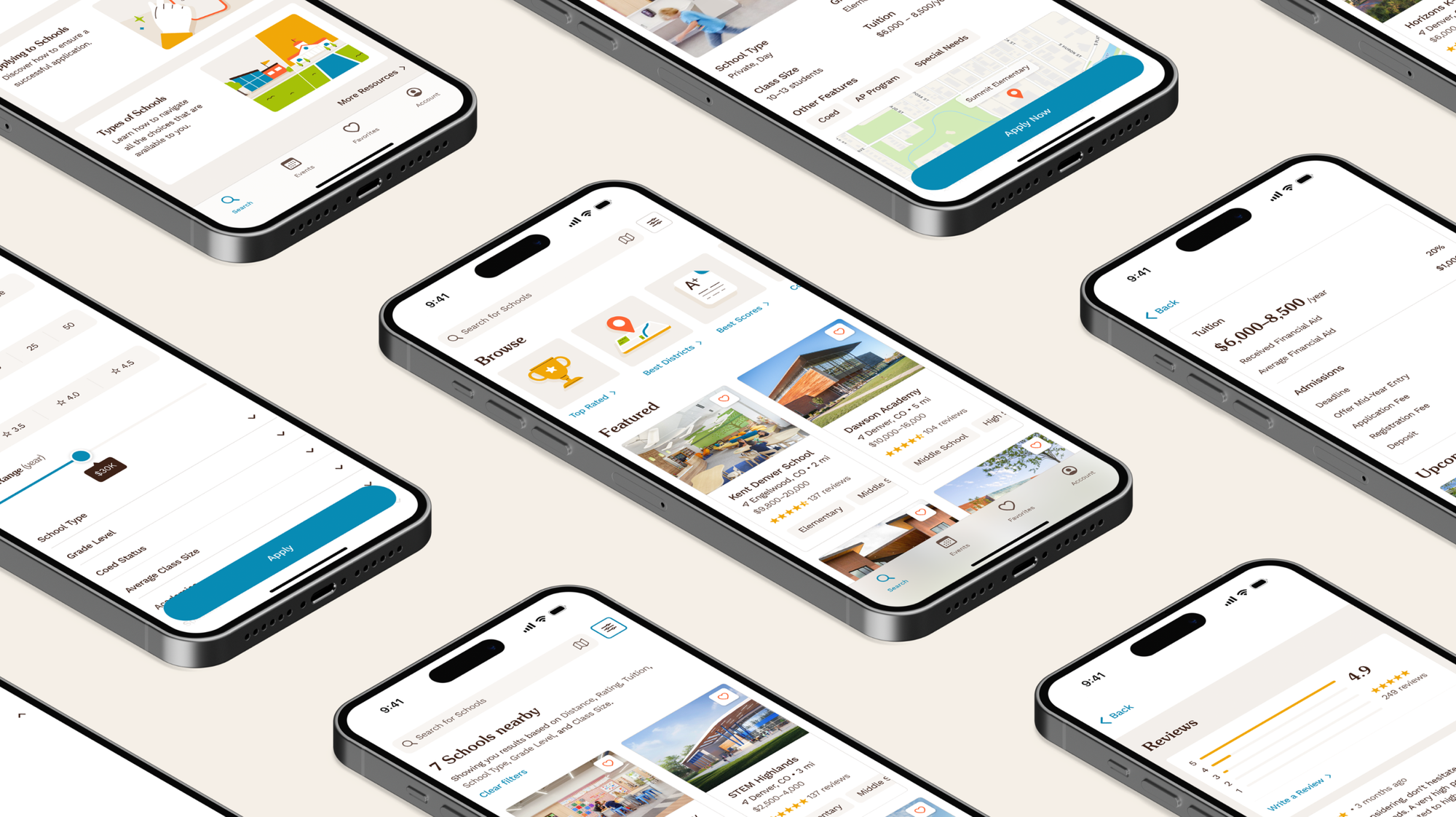
When considering features for Better School Choice, the use of a MoSCoW Analysis showed that prioritizing searching and filtering, event calendars, and personal account features would likely be most beneficial to users.
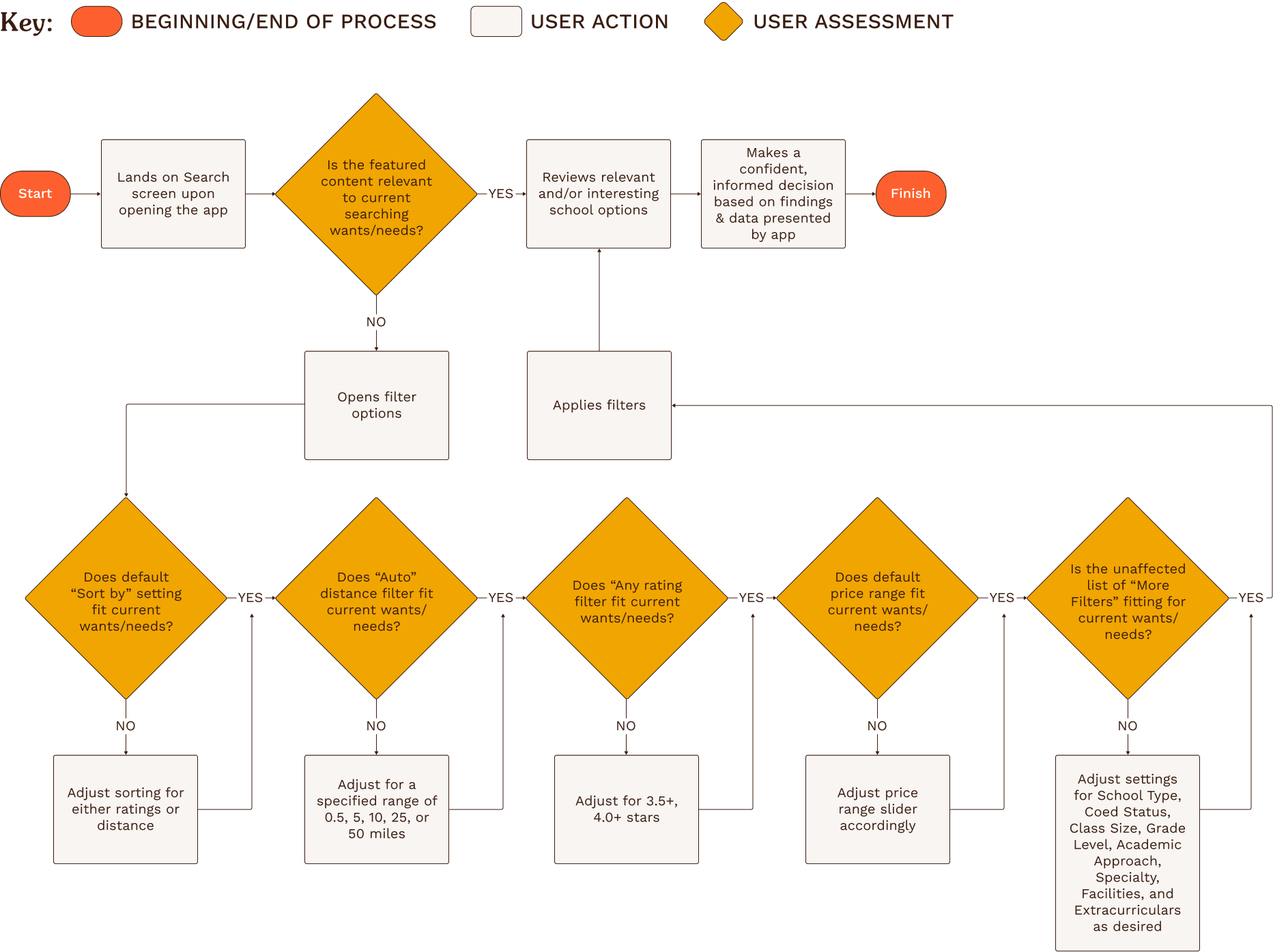
Search and Filters
Developing a user flow offered insight into what conditional logic might need to be applied when considering a user’s search progression.
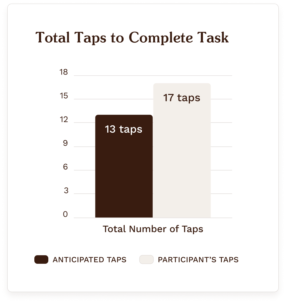
Using a mid-fidelity prototype, I tested a friend and parent of 2 elementary-aged children, asking them to navigate and utilize the search features to locate a school that fit a particular set of parameters.
The goal was to understand the strengths and weaknesses of Better School Choice’s content and structure, and success metrics consisted of completion time and the total number of taps.
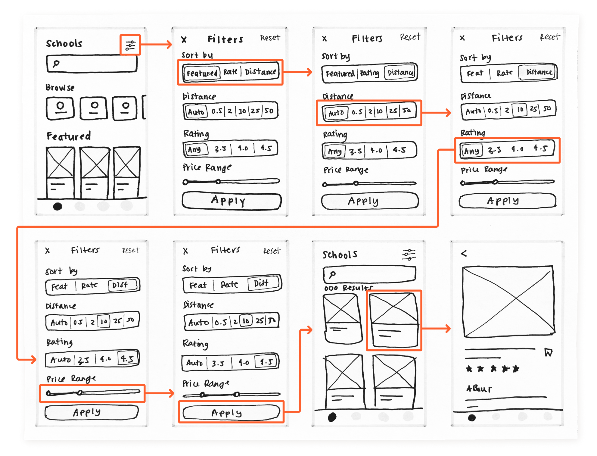
Rapid sketches were also explored before designing mid-fidelity screens to better scope the prototype’s information architecture.
You can check out the prototype provided to test participants below:
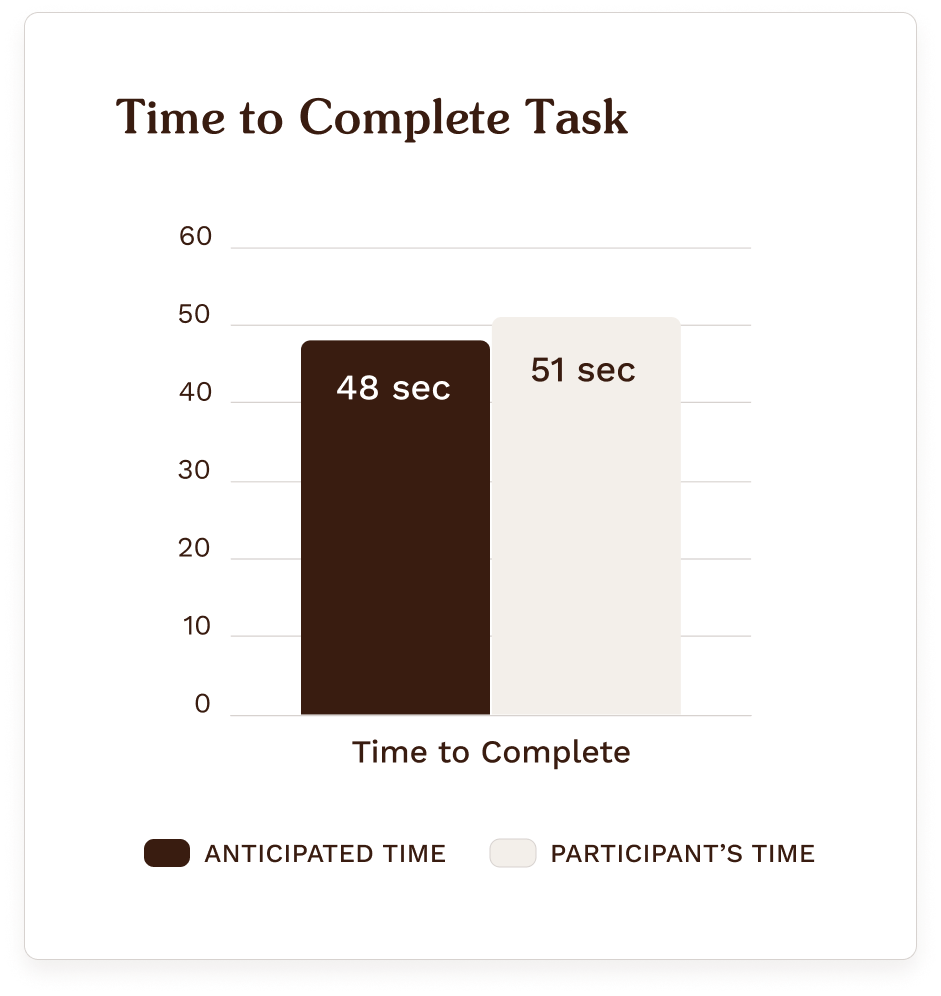
The results were promising, albeit limited, given the scope and shortfall of testing candidates.
Overall, there was a positive response to the prototype’s content and information layout. However, the participant noted that the checkboxes in the drop-down filter options felt visually distant from their associated labels. A few other misguided user actions suggest that adjusting the task scenario language in future tests could add clarity for users.
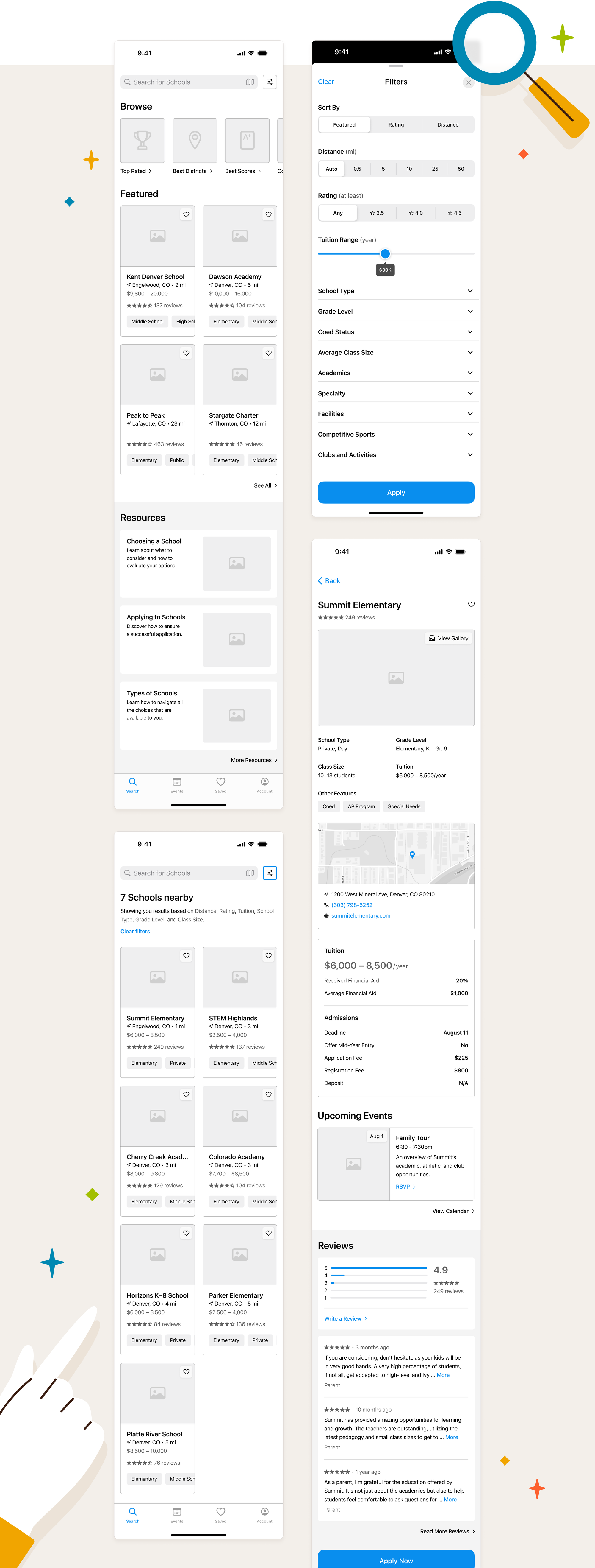
Outcome
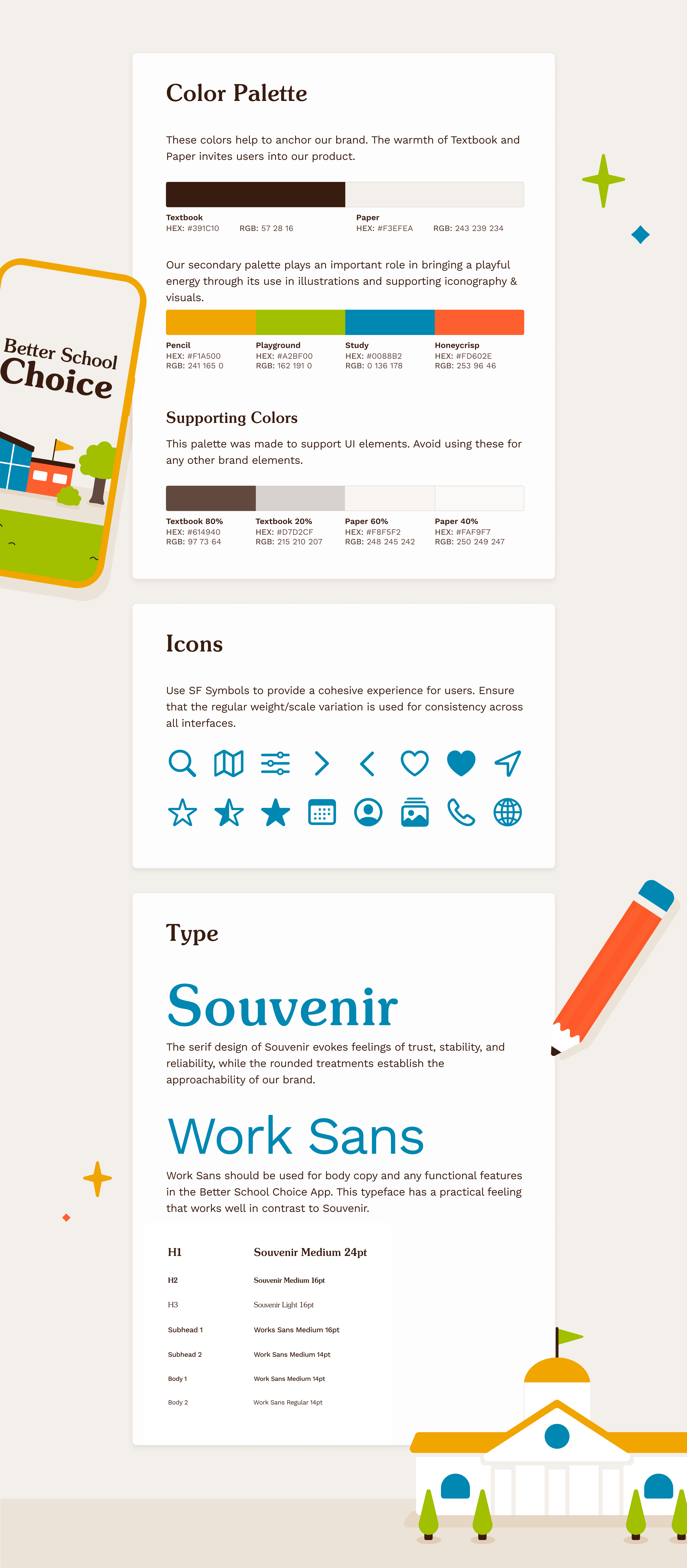
Considerations toward the brand reinforce Better School Choice’s goals for a positive school-searching experience. The visuals and primary & secondary colors keyed up to a warmer palette nod to the target audience’s lean toward elementary schools without feeling too childish. Typeface choices display a sense of reliability and approachability.
The final designs’ prior research and testing results are also apparent, reflecting updates to filter checkboxes and the carrying over of the mid-fidelity design’s information architecture.
Takeaways
This project taught me how to consider user needs and turn them into actionable design decisions—investing time in understanding who this product was for and what products already exist for these users helped shape a comprehensive end product.
If ever given a second chance, I would love to see how things might turn out if I could:
• Spend more time looking at competitors and considering more ways to differentiate this product in the market.
• Test more relevant people before moving into the high-fidelity designs.
• Create additional task scenarios related to other critical screens and develop designs for them.